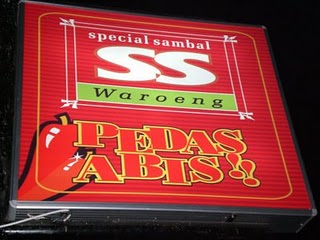
Visual Branding Warung SS

Visual branding is an important element in creating a business’ identity and appeal. Logos, colors, typography, and other visual elements serve as tools to convey a brand’s values, vision, and uniqueness to its audience. However, not all businesses are able to present effective visual branding, including Warung SS, a local restaurant famous for its signature chili sauce. This article will discuss the visual branding challenges faced by Warung SS, especially in terms of its logo and visual identity, based on the principles and theories of visual branding.
Warung SS (Spesial Sambal) is a restaurant that focuses on the diversity of traditional Indonesian sambal. This restaurant has many branches in various cities and is quite well-known for its signature spicy taste. However, despite its strong reputation in terms of menu, Warung SS’s visual branding still has some shortcomings that can affect customers’ first impressions, both offline and online.
SS Warung Logo Analysis
1. Lack of Uniqueness
The Warung SS logo uses capital letters with a simple font and the addition of red chili elements. This design is indeed relevant to the concept of chili sauce, but it is not unique enough to distinguish Warung SS from other restaurants that also sell spicy dishes. According to the theory of distinctiveness in branding, a logo should be able to reflect the uniqueness of a brand and be easily remembered by the audience. Unfortunately, the chili element used is too common so that it does not provide a distinctive identity.
2. Lack of Typography
The font used in the logo looks simple, but does not have a strong aesthetic appeal. The choice of fonts that are too standard reduces the impression of professionalism and innovation of the brand. In branding theory, typography plays an important role in creating a certain impression, such as modernity, traditionality, or warmth. Warung SS could be better if it chose typography that better reflects the local atmosphere and authentic spirit of Indonesia.
3. Less Dynamic Colors
Warung SS uses a combination of red and white, with the addition of green on the chili element. Although red is effective in depicting a spicy taste, the color composition is less dynamic and looks stiff. The principle of color psychology states that color not only affects aesthetics but also the emotions of customers. Utilizing shades of red or adding yellow elements for energy and warmth can increase its visual appeal.
Visual Identity Challenges of Warung SS
1. Visual Element Inconsistency
In promotional materials such as menus, banners, and social media posts, there are inconsistent design variations. The use of colors, fonts, and illustration styles often vary, making the brand identity unclear. According to the principle of coherence in branding, the harmony of visual elements is essential to building strong brand recognition and creating a consistent experience for customers.
2. Not Representing Traditional and Local Values
As a restaurant that serves Indonesian cuisine, Warung SS’s visual identity lacks traditional and local elements. There are no design elements inspired by Indonesian culture, such as batik motifs, traditional carvings, or geometric patterns typical of the archipelago. In fact, including these elements could create an emotional bond with customers who are proud of the richness of local culture.
3. Limitations of Adaptation to Digital Platforms
In the digital era, visual identity must be able to adapt to various formats and platforms. Unfortunately, the Warung SS logo is less flexible for use on digital media, especially small applications or icons. When the logo is reduced, the details of the chili elements become difficult to recognize. The principle of scalability emphasizes the importance of logo design that remains effective in various sizes and formats.
Improvement Recommendations
Logo Redesign
A new logo that is more minimalist and modern with traditional elements can reflect the uniqueness of Warung SS. For example, replacing the chili illustration with a pattern inspired by traditional motifs while maintaining the simplicity of the design so that it is easily recognized.
Color Palette Revision
Warung SS can consider adding more dynamic colors such as yellow or orange to create a warmer and more attractive impression. This combination not only emphasizes the spicy taste, but also depicts the warmth and warmth of their service.
Visual Branding Creation Guidelines
With clear branding guidelines, Warung SS can ensure consistency in all visual elements, from menu design to social media posts. These guidelines should include the use of logos, colors, fonts, and other visual elements.
Highlighting Local Elements
To strengthen its identity as a traditional restaurant, Warung SS can add visual elements inspired by local art and culture. For example, batik motifs or regional carvings can be the background of their promotional materials.
Engaging a Professional Designer
Collaborating with a professional graphic designer or branding studio can help Warung SS create a more strategic visual identity. With expert help, they can ensure that the design is not only aesthetic but also functions well across platforms.
Conclusion
Visual branding is an important investment for businesses, including Warung SS. A strong logo and visual identity can help the business increase its appeal, strengthen its position in the market, and create customer loyalty. By improving the logo, consistency of visual elements, and adding a traditional touch, Warung SS can reflect the uniqueness and values it carries.
https://isi-dps.ac.id/penting-tipografi-dalam-pembuatan-logo/
https://binus.ac.id/malang/2018/12/logotype-dalam-brand/-
https://umkm.kompas.com/read/2022/12/02/124150283/4- hal-utama-yang-perlu-diperhatikan-saat-membuat-logo-brand
https://www.dreambox.id/blog/branding-strategy/ketahui-arti- dan-cara-menentukan-warna-logo-untuk-bisnis-anda/

