
Siloam Clinic Visual Brand Strengthening by Juan Raffael Susianto

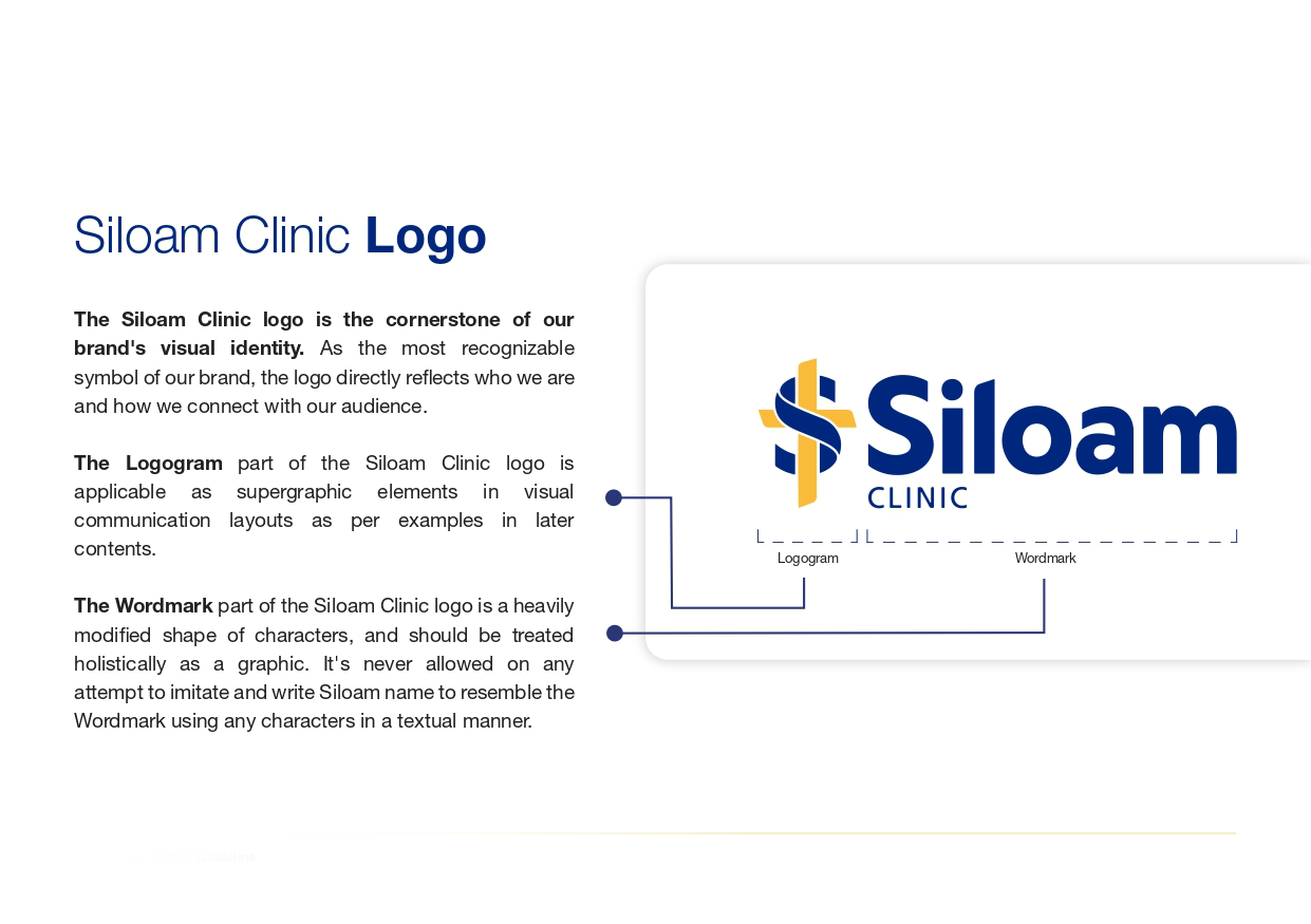
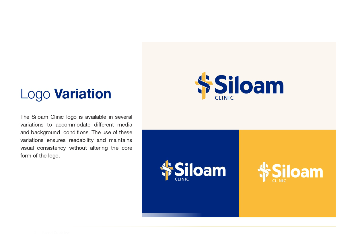
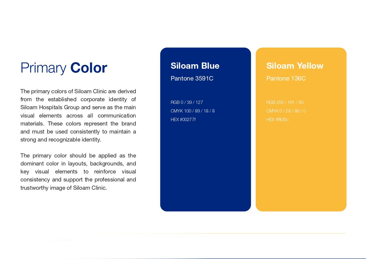
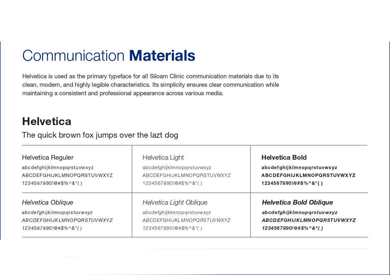
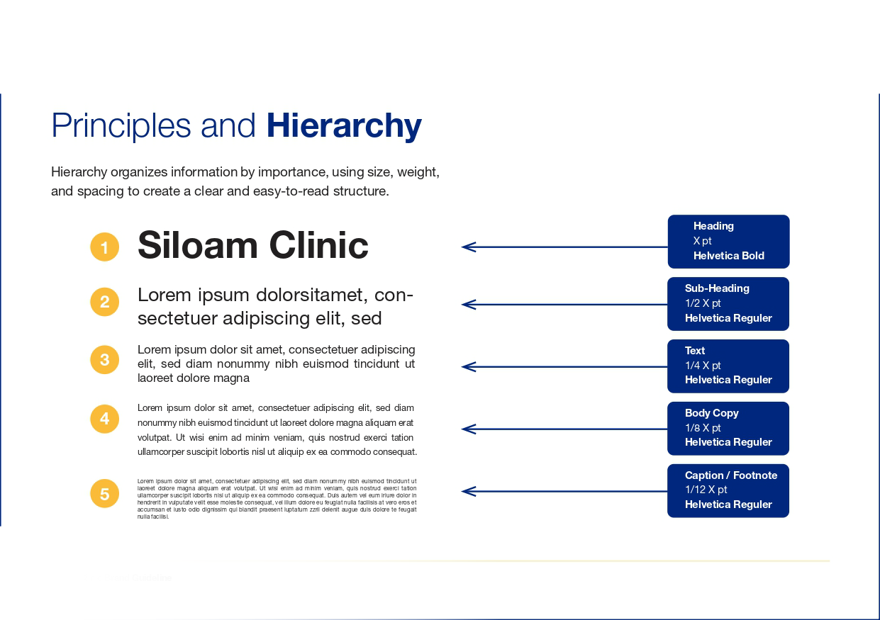
In today’s fast-paced healthcare industry, maintaining a cohesive visual identity is essential for building public trust, brand recognition, and a professional reputation. This project explores how Siloam Clinic applies its core visual identity, including brand colors such as Siloam Blue and Siloam Yellow, typography like Helvetica, clear layout hierarchies, and precise logo usage, across both traditional print collateral and modern digital marketing touchpoints. By evaluating how effectively these graphic elements transition between physical media and digital screens, the study highlights the vital role of design standards in reinforcing a healthcare brand’s credibility and accessibility.
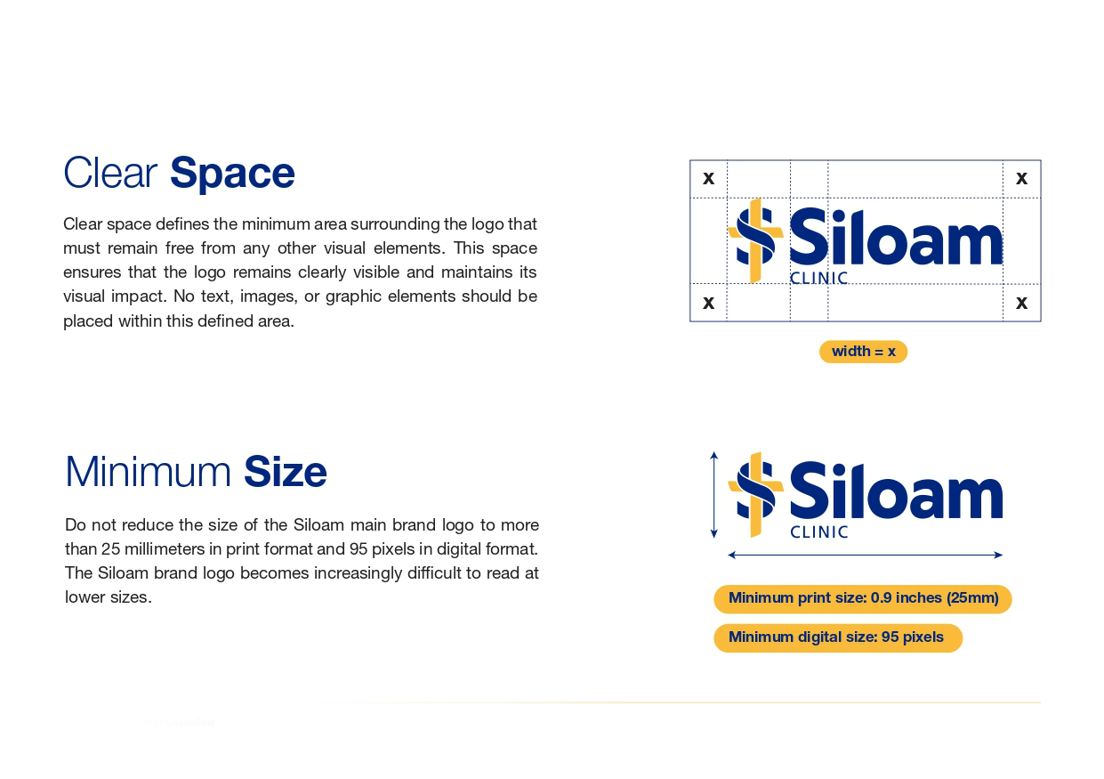
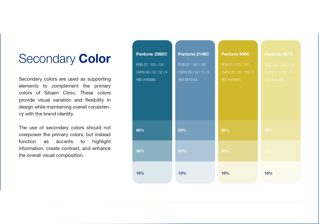
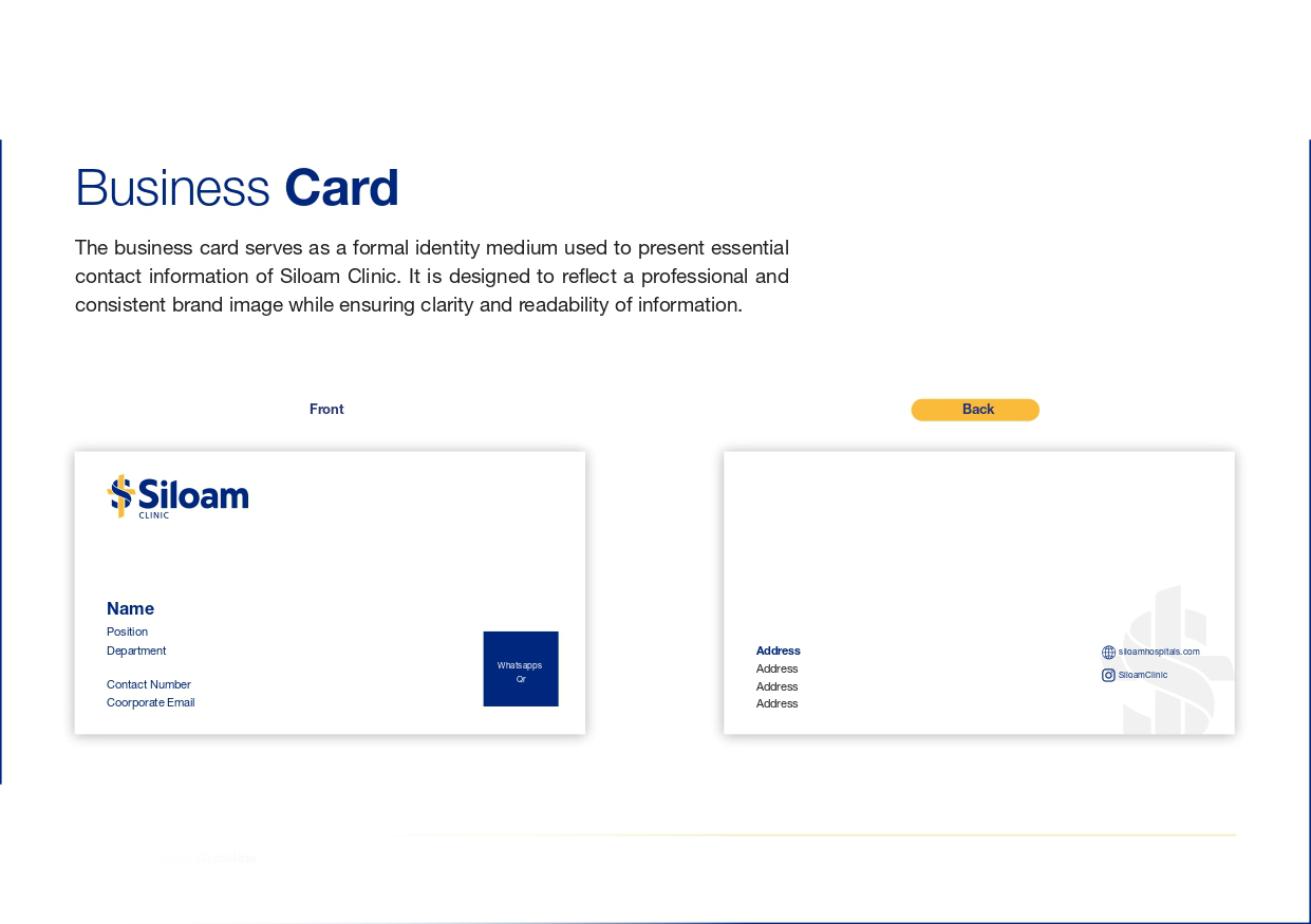
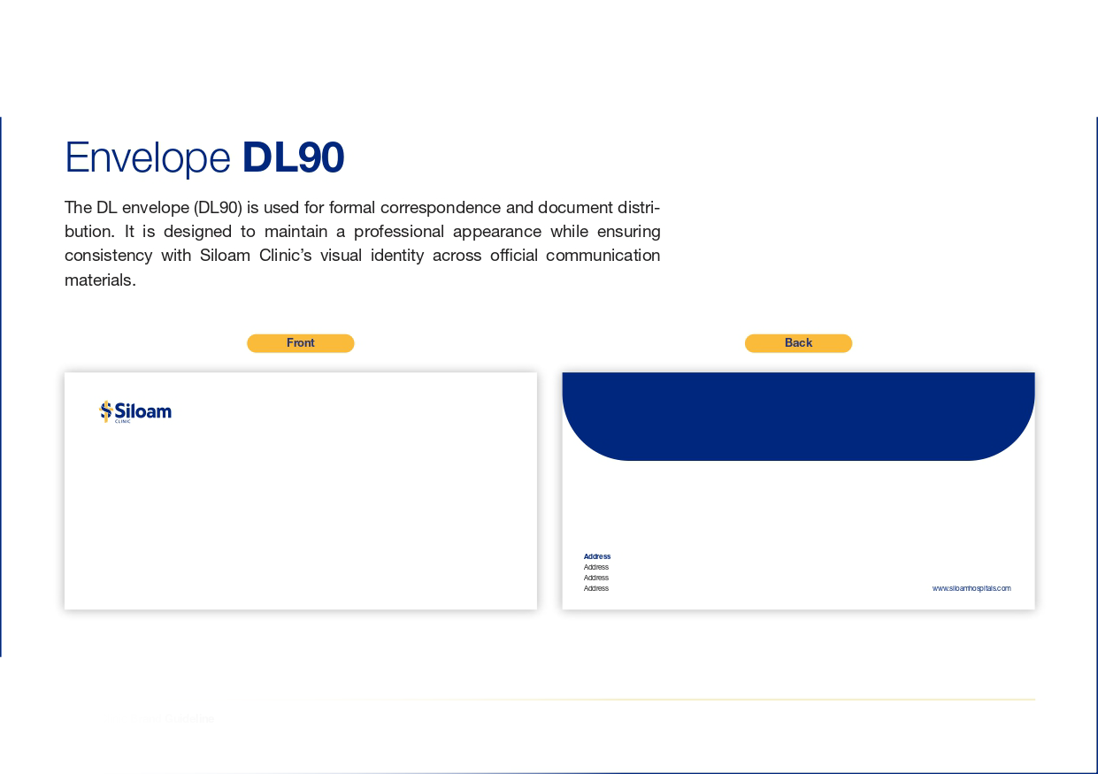
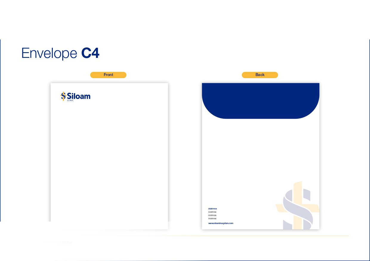
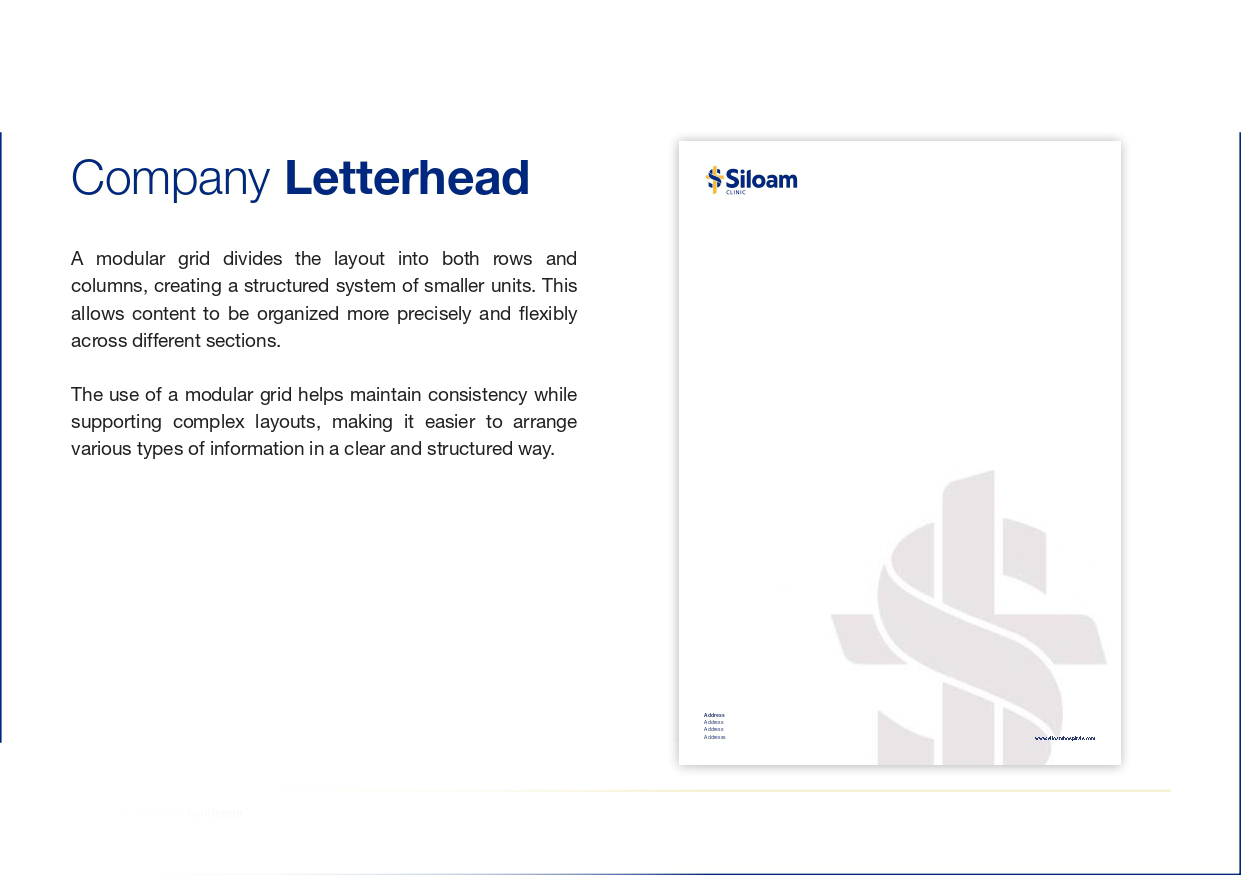
Through a comprehensive examination of promotional assets, ranging from business cards and physical print templates to online interface displays, the research identifies key strengths and potential discrepancies in visual implementation. By analyzing elements such as clear space compliance, color system adherence, and minimum sizing guidelines, Juan Raffael Susianto offers practical insights into optimizing visual communication. Ultimately, this project serves as a compelling case study for graphic designers, marketers, and healthcare managers aiming to bridge the gap between physical and digital brand expressions.