About Visual Branding

Visual branding is an important phase in building a business, as it plays a crucial role in marketing strategy. The benefits of visual branding include brand awareness, building trust and credibility, increasing sales revenue, and attracting consumers. Brand awareness is a marketing term that describes the level of consumer recognition of a product or service by its brand name. Brand awareness is important because it can influence purchasing decisions, many consumers are more likely to buy products they recognize rather than similar products they are unfamiliar with. This is because consumers have already associated the recognized brand with good quality and trustworthiness compared to other brands.
To measure brand awareness, tools like Google Analytics can be used to track metrics such as the number of website visitors, the time spent on the site, and the pages they visit. Additionally, keeping an eye on current trends is essential for capturing consumer attention. Conducting surveys is also important to test brand awareness by surveying consumers in the market. And the last one is, traffic is a key indicator, as it shows the number of visitors coming to the website or brand’s online platform. To increase brand awareness, a brand must deliver messages or information related to its product in an engaging and memorable way. The message should be communicated in a unique manner, especially in comparison to competing brands.
In addition to brand awareness, the benefits of visual branding include
Increasing Business Value, The value of a business is not only determined by the quality of its products and services. However, a business with well-aligned branding will add extra value to its overall worth. You can design a unique and non-monotonous logo to achieve higher business value.
Increasing Business Revenue, The results of visual branding may not be immediately apparent, but its benefits will be felt in the long term, especially in terms of increased business revenue. A memorable visual brand will make consumers stay loyal and less likely to switch to competitors.
Maintaining Business Position, Competing with competitors is a challenge that needs to be overcome for your business to survive in the long run. Having a well-developed brand image is one strategy for maintaining your business’s position amidst the competition.
Visual branding refers to the visual appearance of a brand, which includes elements such as the logo, colors, composition, and other visual components. How a brand promotes itself through social media or other platforms is one method of visual branding. If the design used to promote a brand is bad or unattractive, it will reduce the quality of the brand and lower people’s perception of it. Generally, the function of visual branding is to shape people’s perceptions. Through visual branding, we can capture people’s attention and convey our business message simply through visuals that they see. Visual branding also helps us establish an identity for our business, allowing us to distinguish ourselves from competitors, making it easier for consumers to recognize and remember the brand because of its unique visual elements. Effective visual branding can add value to a business in the eyes of consumers. For example, by designing
a logo with a color theme that stands out from competitors or creating eye-catching packaging designs. Visual branding results may not be immediate and often require adjustments based on the conditions in the field.
Visual Branding Strategy
Here are some strategies for visual branding
The first one is, innovation. We need to pay attention to trends and identify the latest innovations that can be applied to the brand’s appearance. The aesthetic aspects and functional value of the visuals need to be aligned with the target audience to ensure balance.
Next is differentiation. By implementing differentiation, we can set our brand apart from competitors. This approach ensures that the audience can recognize and distinguish the product because it has unique and distinctive characteristics.
Collaboration, can also enhance a brand’s visual branding. Collaboration here means understanding what your consumers or target audience need. We can conduct research to understand consumer needs, and then adapt the findings into the brand’s logo and overall design, making the business more easily accepted as it aligns with consumer preferences and demands
Evaluation is another key step. We must evaluate all aspects of the business after finalizing the brand image. The aspects to be evaluated include the brand’s profit performance, target market, and consumer surveys about your brand. This will help you adjust the business based on real conditions in the market.
And the last one, Brand Management. To control and manage changes within the business, it’s essential to practice good brand management. Keep track of developments and changes in the market to ensure the brand remains relevant to consumer needs.
And the last one, Brand Management. To control and manage changes within the business, it’s essential to practice good brand management. Keep track of developments and changes in the market to ensure the brand remains relevant to consumer needs.

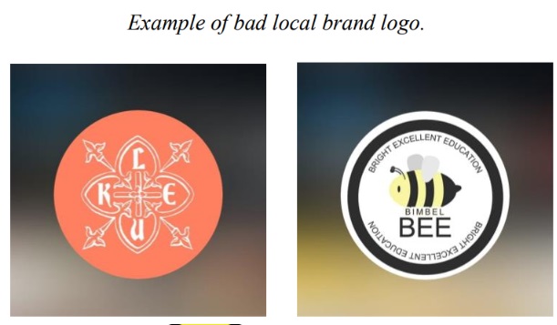
The logos above are examples of failed visual branding. To create an identity for a brand, we cannot simply focus on creating a logo, we must also consider how the logo can provide an attractive and memorable visual for customers. We need to pay attention to the target audience and the tone and manner of the business to create a logo that is both effective and appropriate. A good and effective logo should deliver an attractive and straightforward visual that tells a story and gives the brand its identity.
However, the logos above are not good examples of visual branding because they convey an ambiguous image to the audience. A good logo should not present visuals or images that are unclear or confusing. The placement of elements and typography must also be carefully considered because if an element or logo is misplaced, it can immediately damage the image of the business and create a negative impression of the logo. For this reason, a logo cannot be created carelessly.
In Indonesia, there are still many local brands with good quality, but their visual branding is lacking. for example, often promote themselves on social media with unappealing designs, and their promotional content fails to capture attention. Additionally, many of the logos they create do not use proper hierarchy or visual branding, which makes people less interested in the brand, even though the brand has potential and quality products. Therefore, visual branding is very important and needs to be improved in Indonesia. By enhancing visual branding, Indonesian brands can not only become famous within the country but alsoexpand to international markets.

This is an example of a logo from a local Indonesian brand that, in my opinion is fails. Why do I think it’s a failure? Because both of these logos do not reflect good and proper visual branding. Good visual branding should feature a logo that is simple and easy to remember. The logo on the left is from the brand Luke Artisan Bakery, which sells various delicious and attractive bakery products. However, in my opinion, the logo does not use an appealing visual approach. The logo features complicated elements and doesn’t seem to reflect a bakery brand; instead, it seems more suited for a clothing brand or a product brand rather than a bakery. Additionally, the color choice is not ideal. The brand uses an ambiguous color that seems to be somewhere between orange and pink, like a beige tone, which doesn’t give a strong identity. Moreover, the use of white in the logo makes it harder to read and diminishes its legibility.
The font placement and font choice also make the brand difficult to read. The brand intended to spell “Luke,” but people might read it as “Lkue,” “Lekue,” or something else, which makes the logo visually ambiguous. A logo should not be ambiguous. Furthermore, the composition of the logo, font, elements, and so on still seem poorly executed.
The logo on the right represents a tutoring business called BimbelBee, which targets children who are still in school. In my opinion, this logo also fails because the composition and placement of the elements are poor, making the logo look cluttered with text that is not easy to read or visually appealing. The choice of font is also wrong and not suitable for a logo. The placement of the font and the color scheme of the bee mascot contribute to making the logo unattractive. They should have used more vibrant colors and a font that better appeals to school-age children looking for tutoring services. However, this logo doesn’t reflect the target audience, which is children; instead, it feels more suited to an adult demographic

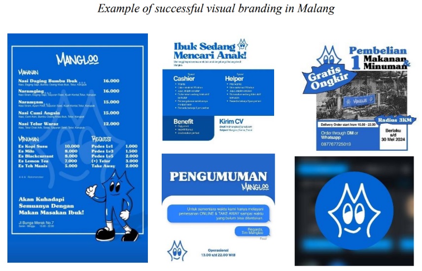
A visual branding example that I think is great and successful in Malang is a restaurant called Mangloo. They really understand how to attract their audience and use very appealing visual branding. They know exactly what kind of target audience they want to reach. The design of the Mangloo logo is also attractive, in my opinion, because they use a cute and simple mascot that aligns with current design trends, giving the restaurant a unique and memorable identity.
The choice of colors and branding design is also very interesting. They use blue and white, with a vintage visual style that still feels modern, blending the vibes of the 2000s with 2024. They clearly understand that their target audience is young college students who are far from home and looking for home-style meals at affordable prices. Their visual branding is strong and compelling, which grabs people’s attention, especially young people, and encourages them to visit the restaurant.
Their choice of words to attract customers is also very clever and humorous. They use phrases like “kata ibuk, kalau dipanggil itu harus dateng”, and “segera memasag resep bunda cantik”, and etc. which make customers feel a connection and comfort with the brand. This creates a sense of nostalgia, as if they’re longing for their mother’s cooking while being away from home. It invites them to visit Mangloo whenever they miss the comforting taste of their mother’s cooking, effectively representing the feelings of customers who long for their mother’s meals

