Goedang Oleh-Oleh: A local hub.


Visual Communication Design, the art of communication without saying anything, at all. It has existed for a long time and as such, we pass by it a lot, maybe a quick glance at a logo or a symbol, and a brief thought flashes in your mind, but, underneath all the shapes and the colors, lies a complex yet well-crafted composure of ideas and thoughts, ever so carefully composed to express whatever message or feeling without having to go up to you directly and saying it, acting as a non-living representative of whatever entity or ideals is behind said composure.
Now, in this very article, lies an example of such concept.
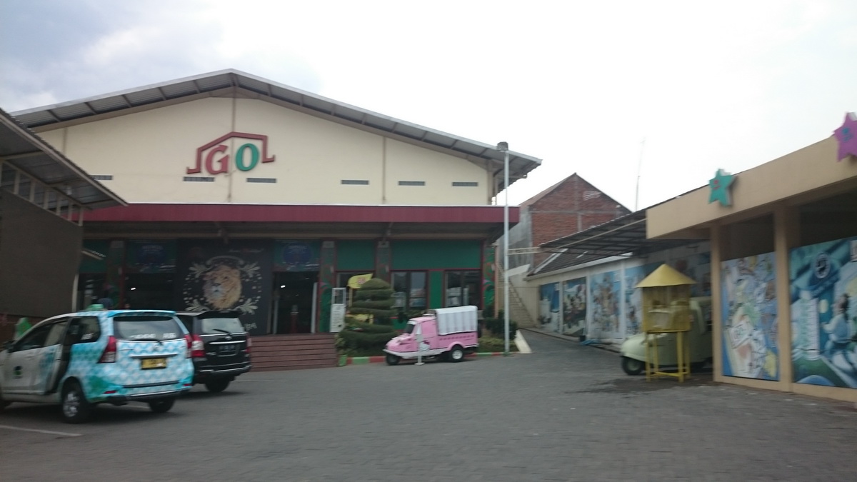
Goedang Oleh Oleh, as the name says is a gift/souvenir shop that was built in 2012, dedicated for all things that someone out of town, be it a domestic or an international, to get all the things they need to have a taste or to give a taste of Malang to the people back home, and as such, it should come as no surprise that it presents itself as a very local business. Aside from that, now we ask, how well does it represent said values visually?
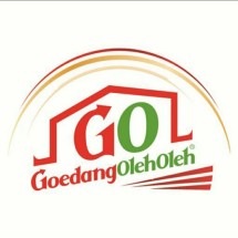
As we can see, while the logo itself doesn’t seem to represent any local values, anything else, such as the advertising posters that are strewn across the walls (such as the example above), have a very local feel to them, going as far as to even use Javanese as their slogan. In terms of their business as a whole, we can see that the logo does represent what looks to be a house or storage, fitting with the “Goedang” part of the business’s branding.
In terms of color palette, it also doesn’t tell us much about the brand’s local values at first, but taking a closer look, with the usage of primarily red and green colors, and acknowledging that Malang is also quite well known for their apples (which, in here can also be either red or green), we can acquire a new perspective and impression on it and can conclude that in a subtle way, it does represent Malang as a whole. Still, it has a glaring issue of the fact that it does not have an impression that represents it otherwise, forcing us to take a deeper insight.
Typography wise, it doesn’t tell us much, but as we can see from the typeface’s characteristic, we can tell that they are using a form of serif font, which can fit with the whole local branding that they’re building, as it is not too bold and modern as sans serif fonts.
CONCLUSION Overall, the issue at hand that exists with this business is the logo that they chose to represent the brand doesn’t tell us much about how local the business is, if at all, and comes across as a branding for the business itself rather than the values that they could represent. So now lies the question; what can they do to fix it?
For starters, they could use more elements that incorporate Malang culture as a whole, for example, such as masks or “Topeng” for example. They’ve already done it with their other promotional posters as shown below; integrating that into the main logo will help with emphasize said values.

