Visual Identity Analysis – Ayam Goreng Pak Maning


Malang, known as one of Indonesia’s creative and cultural hubs, holds many success stories of local brands growing amidst intense business competition. One of the key elements behind these brands’ success is their visual branding strategy. Visual branding not only creates a unique identity but also acts as a communication medium that connects businesses emotionally with their customers.
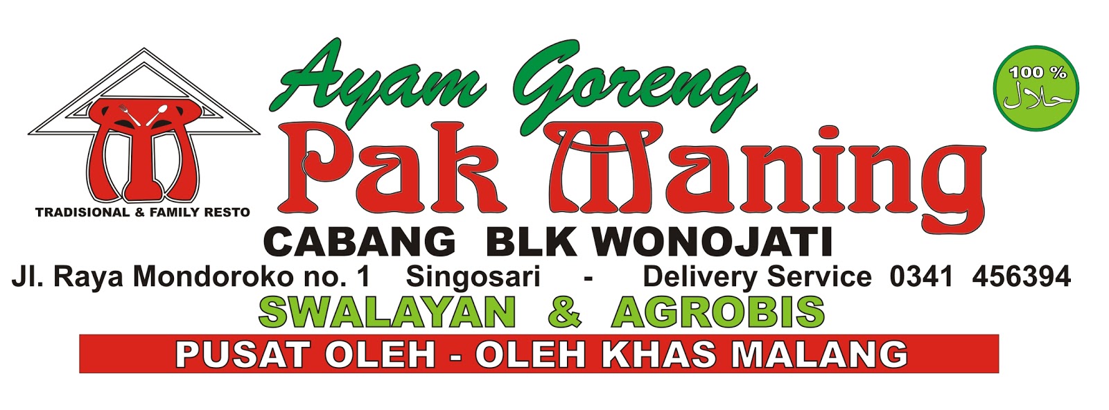
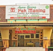
However, many businesses in Malang still have little attention to visual branding. Ayam Goreng Pak Maning is one example I found. Although their use of logos and typography is unique, they don’t pay enough attention to the color choices in their logo. This article will discuss ways to improve the visual branding of Ayam Goreng Pak Maning, helping them stand out in the market and build stronger connections with their loyal customers.

1. Colors
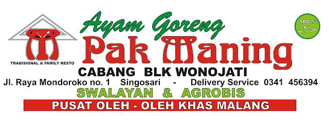
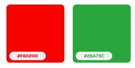
The Ayam Goreng Pak Maning logo is dominated by two colors: green and red, which are commonly found in local brand logos. Red, being the more dominant color in the design, symbolizes courage and attraction. However, its overwhelming presence gives off a sense of imbalance and visual intensity. Green, often associated with freshness and health, is used in parts of the design, such as the “Ayam Goreng” text. Unfortunately, the green appears disconnected from the rest of the elements, making it feel less cohesive overall.

2. Typography
In terms of typography, the “Pak Maning” text uses a serif font with unique ornaments on the
letter “M,” which conveys a traditional feel. While this adds a distinctive identity, the
decorative style makes the text harder to read, especially for those unfamiliar with the brand.
Other textual elements, such as the address, services, and tagline, use too many different fonts
that lack harmony. This creates a less professional appearance and divides the audience’s
attention, making it harder to focus on the brand’s core message.
3. Conclusion
Overall, the logo does reflect traditional and local identity but struggles to communicate its
message effectively and consistently. Simplifying the elements, choosing a more harmonious
color palette, and modernizing the visual and typographic elements will strengthen Ayam
Goreng Pak Maning’s visual branding. These improvements can help the logo create a more
professional, appealing, and relevant impression for modern customers while maintaining its
traditional roots
Jonathan Nie

