
Issues with Visual Branding in Our Community: A Case Study of Local Business Identity
Visual branding is a crucial aspect of any business’s identity, encompassing the strategic use of
visual elements such as logos, colour palettes, typography, and imagery to communicate a
brand’s values and personality. In our community, however, many local businesses struggle
with their visual branding, leading to confusion among consumers and a diluted brand identity.
This article will explore the principles of visual branding, analyse a local business’s logo and
visual identity, and discuss the implications of poor visual branding practices.
Understanding Visual Branding
Visual branding refers to the use of visual elements to create a recognizable identity for a brand.
It includes:
– Logo: The visual symbol representing the brand.
– Color Palette: The specific colors used consistently across all branding materials.
– Typography: The fonts and styles used in written communication.
– Imagery: The photographs and graphics that represent the brand.
These components work together to create a cohesive look that enhances brand recognition and
fosters emotional connections with customers. Effective visual branding can differentiate a
business in a competitive market and establish trust with its audience.
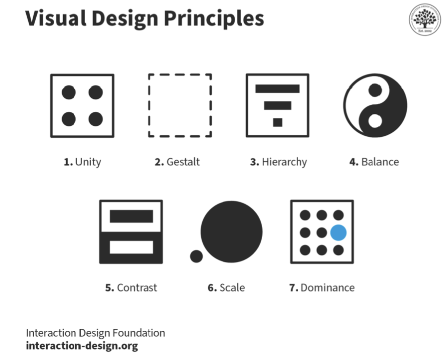
Principles of Visual Branding
Several key principles guide effective visual branding:
1. Consistency: All visual elements should be used consistently across different platforms to
reinforce brand identity.
2. Contrast: Utilizing contrasting colours and shapes helps important elements stand out and
improves readability.
3. Hierarchy: Establishing a clear hierarchy through size and placement helps guide the
viewer’s attention to the most important information.
4. Balance: A balanced design creates harmony within the visual composition, making it more
appealing.
5. Gestalt Principles: These principles explain how people perceive visual elements as unified
wholes rather than individual parts, influencing how logos and other visuals are interpreted.
Case Study: Kopi Kenangan
Visual branding is a critical component of any business’s identity, encompassing the strategic
use of visual elements such as logos, color palettes, typography, and imagery to communicate
a brand’s values and personality. In our community, many local businesses struggle with their
visual branding, leading to confusion among consumers and a diluted brand identity. This
article will explore the principles of visual branding, analyze the logo and visual identity of
“Kopi Kenangan”, a prominent local coffee brand, and discuss the implications of poor visual
branding practices.
For this analysis, we will examine the visual branding of “Kopi Kenangan”, a well-known
coffee chain in Indonesia that has rapidly expanded since its founding in 2017. The café is
famous for its unique offerings, including the “Kopi Kenangan Mantan,” which reflects its
emotional branding strategy.
Logo Analysis
The logo of Kopi Kenangan features a stylized heart that has undergone significant evolution
since its inception:
– Symbolism: Initially designed to represent a “bleeding heart,” reflecting the emotional
theme of nostalgia associated with past relationships, the logo has since been revised to
appear more friendly and less tragic. The current design resembles a “dripping heart,” which
maintains an emotional connection while softening its original impact.- Color Choices: The logo predominantly uses red for the heart symbol, conveying warmth
and passion, while black typography adds sophistication. However, the emotional depth may
not resonate with all consumers; some may find it overly sentimental or confusing if they are
unaware of its backstory.
– Typography: The font used in the logo is casual yet modern, appealing to a younger
demographic. However, it may lack clarity at smaller sizes or from a distance, which can
hinder brand recognition in busy environments like cafes or social media.

These aspects highlight how Kopi Kenangan’s logo attempts to balance emotional resonance
with clarity but may still confuse potential customers unfamiliar with its backstory.
Visual Identity Consistency
Kopi Kenangan’s overall visual identity demonstrates both strengths and weaknesses:
– Marketing Materials: The brand employs vibrant colors and engaging imagery across
various platforms, including social media. However, inconsistencies can arise when different
marketing campaigns utilize varying color schemes or design styles that do not align with the
established logo design. This inconsistency can dilute brand identity over time

– Interior Design: Each Kopi Kenangan outlet is designed to create an inviting atmosphere
that reflects its branding. The use of warm colors and modern decor aligns well with its logo;
however, some locations have reported mismatched themes that do not resonate with the core
brand identity A cohesive visual identity is vital for creating a strong brand presence in the community. When
customers encounter inconsistent visuals, it undermines their trust in the brand and diminishes
its perceived professionalism.
Implications of Poor Visual Branding
The implications of ineffective visual branding for Kopi Kenangan are significant:
– Reduced Brand Loyalty: Inconsistent visuals can lead to a lack of emotional connection
with customers, reducing their likelihood of returning or recommending Kopi Kenangan to
others.
– Missed Opportunities for Engagement: A strong visual identity enhances marketing efforts;
without it, Kopi Kenangan may miss opportunities to engage effectively with its target
audience.
Recommendations for Improvement
To enhance its visual branding, Kopi Kenangan should consider implementing several
strategies:
1. Logo Refinement: While the current logo has emotional significance, refining it further for
clarity could improve recognition without losing its sentimental value.
2. Establishing Brand Guidelines: Creating comprehensive guidelines for color usage,
typography, and imagery will help maintain consistency across all platforms.
Conclusion
Businesses’ perceptions in their communities are greatly influenced by their visual branding.
Finding it both advantages and disadvantages to Kopi Kenangan’s visual branding strategy,
which are representative of larger patterns influencing contemporary local companies.
Although Kopi Kenangan has been effective in evoking strong feelings through its distinctive
products and nostalgic motifs, there are still issues with the visual identity’s coherence and
clarity.
Kopi Kenangan’s logo’s transformation from a melancholier depiction to one that aims for
warmth shows that the company understands consumer sentiment, but it also draws attention
to the dangers that can arise when feelings cloud judgment. Clarity becomes crucial as
customers navigate a more crowded market with numerous competing coffee brands; they must
be able to swiftly identify and recall brands among a deluge of options.
Additionally, inconsistent marketing materials.
Reference:
https://finance.detik.com/berita-ekonomi-bisnis/d-6153142/sad-ini-arti-di-balik-logo-merek-
kopi-kenangan
Ungkap Strategi Marketing Brand Kopi Kenangan Dalam Negeri vs Luar Negeri
https://www.masvian.com/2023/01/logo-kopi-kenangan-makna-logo-png.html
Bongkar Rahasia Marketing Brand Kopi Kenangan yang Digemari Banyak Orang
https://seeklogo.com/vector-logo/486006/kopi-kenangan
https://openlibrary.telkomuniversity.ac.id/pustaka/210617/perancangan-strategi-kreatif-
promosi-kopi-kenangan-hanya-untukmu-dalam-bentuk-buku-karya-ilmiah.html
https://id.wikipedia.org/wiki/Berkas:Kopi_Kenangan.svg
Nicholaus William – 2702234030