
Visual Branding Challenges in Malang City: A Review of Local Business Identity
Visual branding is a cornerstone of effective marketing, serving as the first point of
interaction between businesses and their audiences. It encompasses logos, color schemes,
typography, and other visual elements that shape a brand’s perception. In Malang City,
Indonesia, known for its rich cultural heritage and bustling local business ecosystem, visual
branding is a vital tool for establishing competitive advantage. However, many local businesses
struggle with creating cohesive and impactful visual identities. This article explores the
challenges faced by businesses in Malang, with a detailed analysis of specific cases and
suggestions for improvement grounded in visual branding principles.
• Understanding Visual Branding
Visual branding is more than just aesthetics; it communicates a brand’s values,
mission, and unique selling points. According to branding theory, a strong visual
identity should be:
1. Memorable – Easily recognizable and unique.
2. Relevant – Resonates with the target audience.
3. Consistent – Maintains uniformity across all platforms and mediums.
4. Adaptable – Flexible for various formats and applications.
When these principles are neglected, businesses risk blending into the crowd or
projecting an image that fails to align with their offerings.
• Review Visual Identity 1: A Local Cafe Shop in Malang – Nakoa Café
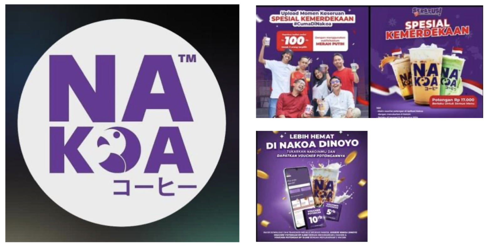
Based on the logo, the strength is nakoa logi have simplicity and clarity, the logo
uses bold, sans-serif typography, making it easily readable. This simplicity helps in
brand recall. The purple hue conveys creativity, uniqueness, and quality, which are
essential for a coffee shop’s branding to stand out in a competitive market. The circular icon with a bird/coffee bean/abstract shape within the “O” adds a visual element that
differentiates the logo. This can also symbolize friendliness or a connection to nature,
possibly tying into themes like organic coffee or relaxation. The inclusion of Japanese
text (“コーヒー” meaning “coffee”) gives it a distinctive cultural identity that might
appeal to a niche audience interested in Japanese-inspired experiences (but for who
doesn’t know the meaning it’s a weakness).
While the font is strong, pairing it with a complementary secondary font could
add a layered aesthetic and help emphasize specific elements, such as the Japanese text.
The bird/abstract design in the “O” is eye-catching but might not be immediately
associated with coffee unless its significance is explained elsewhere (e.g., in
marketing). The logo’s circular design might pose challenges in smaller applications,
such as on merchandise or mobile screens, where the Japanese text and small details
may lose legibility. If the brand emphasizes coffee culture, the visual might benefit from
more direct coffee-related elements, such as beans, cups, or steam, to reinforce the core
offering. The solution I think is maybe they can add subtle coffee imagery or motifs
within the iconography could make the logo more self-explanatory. Adjust the size or
placement of the Japanese text to create a clearer hierarchy and reduce potential
confusion for non-Japanese-speaking audiences. Develop a secondary, minimalist
version of the logo to ensure adaptability across different mediums. This logo has a
strong base but could benefit from minor refinements to better reflect the brand’s
identity and purpose.
• Review Visual Identity 2: A Local Bakery Shop in Malang – MoMo’S
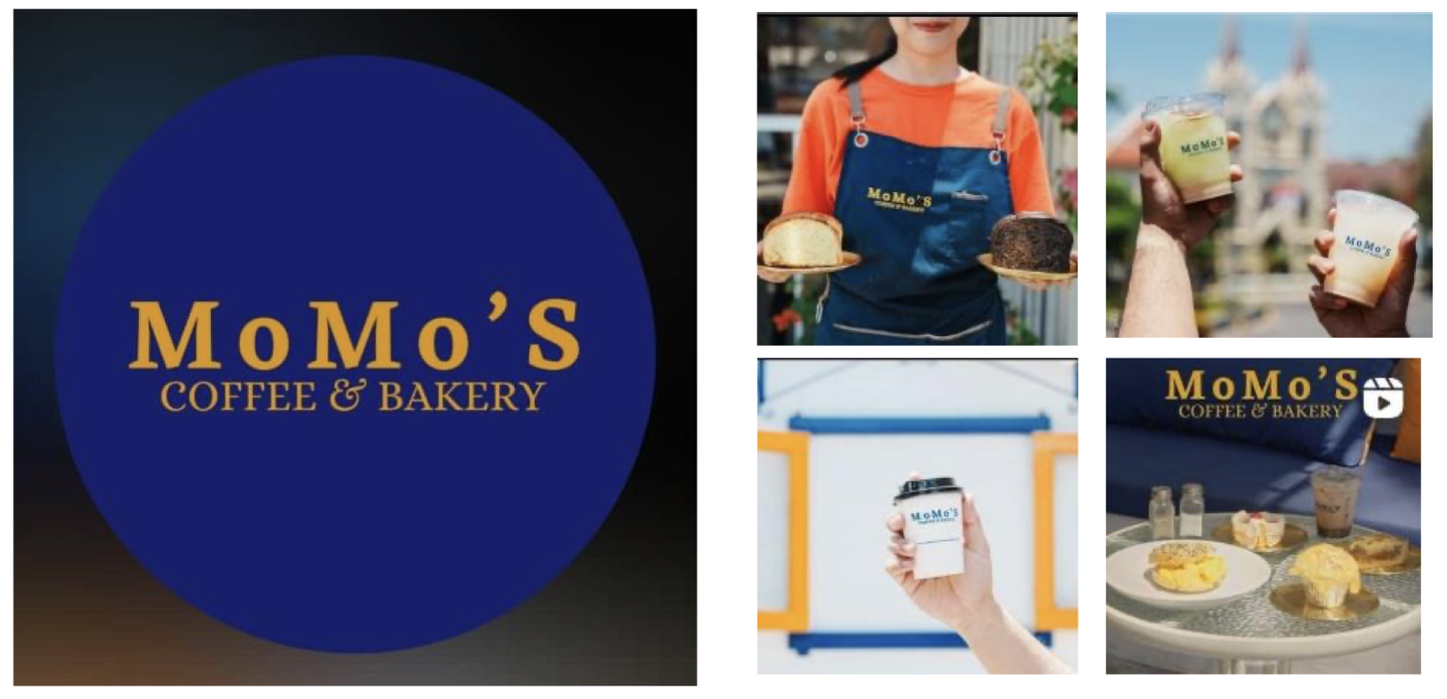
The serif font style conveys a sense of tradition and reliability, which aligns well
with bakery and coffee shop values. The use of capitalized “MoMo’S” emphasizes the
brand name, making it easy to recognize and memorable. Combination of dark blue and
gold creates a sense of elegance and sophistication. Gold often symbolizes quality and
premium service, which could appeal to higher-end customers. The high contrast
between the text and the background ensures readability. Including “COFFEE &
BAKERY” clearly communicates the shop’s core offerings, avoiding ambiguity.
But of course there are still a few things that need to be improved. The design
feels somewhat generic. Many coffee shops use serif fonts and circular logos.
Incorporating unique symbols, patterns, or motifs (like bread or coffee beans) could
better reflect the brand identity. Also, “MoMo’S” dominates the visual hierarchy, while
“COFFEE & BAKERY” is smaller. If the business wants to equally emphasize both
coffee and bakery, adjusting the size or placement of the tagline may be necessary.
While the logo works well for larger formats, the detailed tagline might lose clarity in
smaller applications, such as on social media avatars or small merchandise. The logo
conveys formality but lacks playfulness or warmth, which are qualities often associated
with coffee and bakery shops. Adding softer elements could create a more inviting look.
Overall, the logo is professional and visually appealing but could benefit from
enhancements to stand out in a competitive market and better reflect the warmth and
personality of a coffee and bakery shop.
• Common Visual Branding Challenges in Malang
The coffee shop’s issues are indicative of broader challenges faced by many businesses
in Malang:
1. Overreliance on Trends
Many local businesses adopt design trends without considering their brand’s
individuality. For example, numerous cafés and boutiques in Malang use
pastel tones and minimalist fonts simply because these styles are
fashionable. While trendy elements can be effective, excessive reliance on
them leads to visual identities that feel generic and lack longevity. For this
problem they can try to conduct a brand audit to identify unique traits and
incorporating them into the visual identity ensures that the design stands the
test of time.
2. Lack of Professional Input
Small and medium-sized enterprises (SMEs) in Malang often design their
branding in-house or hire inexperienced designers due to budget constraints.
This results in amateurish visuals that fail to convey professionalism. From
this problem they need to invest in professional branding services, even on
a small scale, can significantly improve brand perception. For example,
collaborating with design students or local agencies could offer affordable
yet professional results.
3. Inconsistent Application
Consistency is vital for building brand recognition. However, many
businesses in Malang fail to standardize their branding across platforms.
Logos, colors, and typography often vary between physical stores, websites,
and social media. For this problem they need to develop a brand guideline
document can help ensure uniformity. This document should outline
approved colors, fonts, logo usage, and visual styles for all media.
Despite the challenges, Malang’s businesses have immense potential for visual
branding innovation. By adopting a strategic approach, they can turn their visuals into a
powerful marketing tool. Most of the local business already use platforms like Instagram and
TikTok thrive on visuals. Malang-based businesses should invest in high-quality photography
and cohesive feeds to attract a wider audience. Creating visually appealing posts and stories,
aligned with the brand’s identity, can boost engagement. They can also experiment with Motion
Graphics because videos and animations are increasingly popular formats for branding.
Businesses in Malang can use short, branded animations to explain their services or share
promotional content. Visual branding should extend beyond marketing materials to include the
customer’s in-store or online experience. This involves designing attractive interiors,
packaging, and websites that align with the brand’s identity.
Visual branding is a critical, yet often overlooked, aspect of business success in Malang
City. The case study of the coffee shop and broader challenges reveal a common pattern of
inconsistency, lack of professional design, and missed opportunities for cultural integration. By
addressing these issues and leveraging Malang’s unique identity, businesses can create visuals
that captivate their audience and establish lasting brand loyalty. With thoughtful investments
in design and storytelling, Malang’s local businesses have the potential to set new standards in
visual branding excellence.
Fania Margaretha | 2702236982