
Visual Branding of Toko Kain Nelly in Malang
Visual branding is one of the most important aspects in creating a strong brand identity. Every design element, from logos, color palettes, typography, to other graphic elements, plays a significant role in shaping how consumers perceive a brand. In Malang city, many businesses are competing to create a strong image in the local market. One such business is Toko Kain Nelly, a local shop that offers various types of quality fabrics. In this article, we will explore the visual branding of Toko Kain Nelly, analyze their logo and visual identity, and how these elements influence consumer perception of their business.
Toko Kain Nelly is located in the heart of Malang city and has become known as one of the go-to places for high-quality fabrics. Offering a wide variety of fabrics, ranging from everyday clothing fabrics to special-use fabrics, Toko Kain Nelly has become a preferred choice for many local customers. Consistent and attractive visual branding has been key to their success in introducing their business in an increasingly competitive market.
Basic Principles of Visual Branding
Before diving deeper into Toko Kain Nelly, it is important to understand some basic principles of visual branding that serve as a foundation in the design process and brand identity creation:
1. Consistency Consistency in visual branding ensures that every design element used by the brand remains the same across all platforms and points of interaction. Consistency creates strong recognition and builds customer trust. A consistent logo, color palette, and typography will reinforce the brand’s identity.
2. Simplicity Simplicity in design helps the audience more easily remember and recognize the brand. Brands with overly complicated or excessive designs can confuse the audience and make it difficult to recall them. A simple design that is easy to understand and has a clear meaning can leave a more lasting impression.
3. Relevance Effective visual branding should be relevant to the target audience. Every visual element, from the logo to the color palette, should reflect the values and messages the brand wants to communicate to its customers.
4. Uniqueness Visual branding must have elements that distinguish the brand from its competitors. This uniqueness will help the brand be more easily remembered and stand out in a crowded market.
5. Emotional Appeal Effective visual branding also connects the brand with its audience on an emotional level. Colors, images, and other design elements can be used to evoke certain feelings, such as trust, comfort, or excitement.
Toko Kain Nelly is a great example of applying the right visual branding principles. From their simple yet distinctive logo to the use of design elements relevant to their target audience, Toko Kain Nelly has successfully built a strong image in the local market. Below are some visual elements that make Toko Kain Nelly stand out.
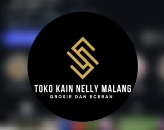
Logo: A Simple Yet Effective Representation
The logo of Toko Kain Nelly is one of the main visual elements used to build their brand identity. This logo combines clear typography with an image element relevant to their business, such as a fabric or pattern that reflects the products they sell. The logo design uses neutral colors that reflect quality and reliability, which are the core values Toko Kain Nelly wants to convey to its customers.
This logo creates a simple yet direct impression, reflecting the products and goals of their business. The choice of sans-serif font that is easy to read gives the logo a modern and professional look.
Color Palette: Conveying Trust and Quality
The color palette used by Toko Kain Nelly is another important visual element that helps build a strong brand image. Neutral colors such as brown, black, and white give an elegant and high-quality impression, which is very suitable for the type of products they sell—high-quality fabrics. These colors also create a sophisticated ambiance, which resonates with customers who are looking for top-quality fabric for daily use or special events.
The consistent use of this color palette across their marketing materials, including their physical store and social media, strengthens Toko Kain Nelly’s brand identity and makes it easier for customers to recognize their brand. The colors used create a trustworthy impression, which is crucial in the fabric business, where customers want to be sure they are purchasing the best quality products.
Typography: Clean and Readable Fonts
Typography also plays a significant role in creating strong visual branding. Toko Kain Nelly uses modern and clean sans-serif fonts, which give a professional and elegant impression. The choice of font aligns well with their business goals, aiming to appear modern and reliable. In addition, easy-to-read fonts are essential to ensure that information about products or services can be clearly understood by customers.
Consistency in the use of typography across various touchpoints, whether in the physical store, product catalog, or online platforms, helps Toko Kain Nelly build strong brand recognition in the minds of consumers.
Problems with Visual Brand Imaging
In graphic design and visual branding, legibility and brand recognition are crucial. A good logo should provide a clear picture of who the brand is and be easily recognized by the audience. However, Toko Kain Nelly’s logo faces a problem with the length of the text used. The long name can cause difficulties in quick reading and make it less effective as a visual identity. In some cases, a logo that is too long or complicated can make it harder for people to instantly remember or recognize the brand.
A good logo should be easy to understand and remember, as well as convey an immediate impression of the type of business being run. If the store name is printed too long and is difficult to read quickly, it can reduce the effectiveness of the logo in creating strong brand recognition. A simpler logo with a name that is easier to recognize would better help build brand awareness, especially for a brand that is still growing in a very competitive market.
Elegant Colors but Inconsistent Across Platforms
Toko Kain Nelly has chosen an elegant color palette that reflects the high quality of their products. The use of neutral colors, such as brown, cream, or softer pastel colors, gives a professional and sophisticated impression. These colors are suitable for a brand that offers premium-quality products such as fabric. This could attract customers looking for high-quality fabric and wishing to experience a sense of elegance while shopping.
However, they face a challenge in maintaining color consistency and visual style across their digital content. Product photos or video reels that appear too bright, contrasting, or overly simple can damage the brand image they have built through their elegant logo. This can make customers feel confused and unable to connect the offline and online branding. Consistency in color and theme is a key part of brand imaging, and Toko Kain Nelly needs to pay more attention to color consistency in every piece of content they create, whether on Instagram, their website, or in their physical store.
Lack of Organization in Reels and Postings
As social media trends evolve, video reels have become one of the most effective tools for communicating with the audience, especially for local businesses that want to introduce their products in a more dynamic and engaging way. However, I feel that Toko Kain Nelly’s video reels appear disorganized and poorly arranged. For example, in some of their videos, there is inconsistency in how the images are arranged, the music used doesn’t match the tone of the brand, and the video quality may seem less professional.
This can reduce their brand’s credibility in the eyes of the audience and make them seem less classy. In the world of visual branding, consistency and content quality are essential to strengthening the brand image. If the videos or content they upload are not well-organized, not only will the brand image be affected, but customers may also feel that Toko Kain Nelly is not professional in managing and promoting their products.
Meanwhile, their Instagram posts, which should be a key promotional tool, don’t always follow the latest visual trends and tend to be too static. Posts with disconnected product images, without a theme or uniform visual style, make their content appear less dynamic and engaging. In the fast-moving world of social media, trends change rapidly, and it’s important for a brand to keep up with evolving visual design trends that are more creative and appealing to the audience, especially younger customers who are more sensitive to visual aesthetics.
Reference:
https://kumparan.com/jendela-dunia/3-toko-kain-di-malang-yang-terlengkap-dan-berkualitas21tdFV64oc5
https://www.behance.net/search/projects/visual%20identity https://binus.ac.id/malang/2018/12/visual-identity-vs-brand-identity/ https://www.instagram.com/tokokainnelly.malang/
Elvina Nurin Salsabila