
VISUAL BRANDING AYAM GEPREK SA’I
Ayam Geprek Sa’i is a restaurant spread across Indonesia that presents the taste of crushed chicken dishes with spicy onion sauce on top. Ayam Geprek Sa’i has become a favorite destination for food lovers whose main ingredient is chicken, especially those who like the taste of spicy dishes. This restaurant offers a variety of home-cooked dishes, such as kale, fried onions, and many more that have the characteristics of home cooking. With cheap prices and a comfortable and clean place, making it an excellent choice for lunch with family. Visual branding is an important element in creating identity and appeal in business. Logos, colors, typography, and other visual elements that function as tools to convey the values, vision, and mission as well as the uniqueness of a product to its audience.
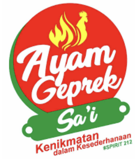
However, not all businesses can provide an effective visual logo, such as the one I am currently exploring, namely Ayam Geprek Sai, a local restaurant that is already widely spread in Indonesia which is famous for its crushed chicken dishes with spicy onion sauce on top. This article will discuss the visual logo used by Ayam Geprek Sa’i, especially in terms of its logo and visual identity, based on the principles and visual logo. The logo uses a red base color and uses white accents in the text and yellow in the shape of the chicken. However, it is unfortunate that the text in the logo is less precise.
PRINCIPLE OF DESIGN
Ayam Geprek Sa’i, as a brand that embraces crushed chicken dishes, is very much in line with the five design principles of simplicity, consistency, relevance, uniqueness, and emotional appeal. Because the Ayam Geprek Sa’i logo reflects a strong identity, it is easily recognized by its audience.
In addition, the visual elements are carefully crafted to convey a simple but effective message, while building a unique character that can differentiate it from its competitors. Through these five principles, Ayam Geprek Sa’i becomes a clearer visual identity, depicting the symbol of chicken dishes and warmth that attracts its own customers.
Here are five principles that support Ayam Geprek Sa’i
1. Simplicity This principle of simplicity gives the impression that a design must be easy to understand and easy to remember. The “Ayam Geprek Sa’i” logo uses minimalist elements of circles, chickens, and fire to represent its purpose. The typography used is also a relaxed font (many curves and not firm), making it easy to read at a glance. With this principle of simplicity, it also increases recognition and makes the logo versatile for various uses (for example: packaging, order bags, and nameplates).
2. Consistency The principle of consistency in design elements is useful for creating harmony and strengthening brand identity. The logo maintains a related color palette of red, green, yellow, and white, ensuring that the elements feel harmonious. In addition, the typography and imagery are well aligned, supporting the elements in one theme, namely the crushed chicken dish cooked in the restaurant. This consistent design goes a long way in building a brand that is trustworthy and easily recognized and also quite easy to remember.
3. Relevance The principle of relevance is useful to ensure that the design is aligned with the intent and purpose of the audience and the brand. The image in the logo “Ayam Geprek Sa’i” a chicken, and fire, directly reflect that food and cooking are made from chicken. These elements relate to the essence of chicken-based dishes, which prioritize or emphasize a modified home-style chicken dish and a spicy taste. The tagline “Kenikmatan dalam Kesederhanaan #SPIRIT 212” makes it more relevant to the context of the logo.
4. Uniqueness The principle of uniqueness referred to in this principle is that a logo must be different from other competitor logos. A logo that gives a unique impression and stands out among competitors makes its brand easy to remember. The integration of fire in the “Ayam Geprek Sa’i” logo with a structure like a chicken tail provides a distinctive identity related to its main ingredient, namely chicken. The focus on chicken, a staple food with a new meaning, and a relaxed but bold font further distinguish this brand from generic restaurant logos. This uniqueness increases the appeal and memorability of the brand.
5. Emotional Appeal The principle of emotional appeal is one that connects with the audience on a personal level. The red in the logo evokes feelings of hunger, excitement, passion, and excitement, while the yellow adds warmth and positivity. The chicken head and firelike tail tell us that the restaurant’s main ingredient is spicy chicken, appealing to the emotions associated with wanting to try just how spicy the smashed chicken dish is. The tagline adds a sense of fun that is created simply, making customers feel drawn and invited to the restaurant.
CONCLUSION
A logo that successfully balances these design principles to create a memorable brand identity is both relevant to the ingredients it is cooking and emotionally appealing. Its simplicity and relevance make it clear and instantly memorable, while its uniqueness and emotional appeal make it compelling and deeply connect with its audience. A consistent design reinforces the brand’s presence and makes it easy for the audience to recognize it.
Reference:
https://isi-dps.ac.id/penting-tipografi-dalam-pembuatan-logo/ https://binus.ac.id/malang/2018/12/logotype-dalam-brand/-
https://ayamgepreksai.com https://www.instagram.com/ayamgepreksai_suhat/
Nicolas Bernard