
Visual Branding Challenges: A Case Study of Local Business Logos

About Visual Branding
The work of visual branding is to give visual existence to a brand-name and a logo with distinctive features that are easily memorable to the public. It is much more than designing a logo; it’s about creating a visual language that will represent the values and personality of the brand. This process is crucial for the brand’s success because, with good visual branding, reaching the market would be easier and could help the business to grow faster. A distinguished identity can be created if the visual branding goes well, which will connect the product with the consumers, thereby improving the brand recall.
To help communicate your brand effectively to your audiences, some key visual
elements need to work together to create your cohesive visual “language.”
What are those key visuals?
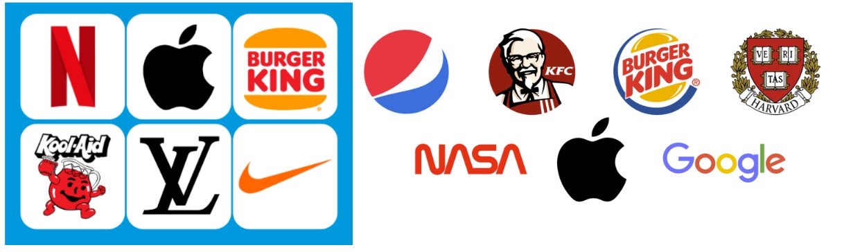
1. Brand Mark/USP
A brand mark is a form that represents a brand in a way that consumers can quickly identify a product. Even though it may appear to be simple, a logo is constructed through a detailed process and careful considerations in terms of representing the identity and appeal of the brand. The logo forms the basis of a visual identity, but true visual identity involves other design elements that complete the brand. Equally crucial to achieving successful visual branding is an understanding of the unique selling point (USP) of the brand. In visual branding, one needs to capture the USP of the brand, which makes it different from others. The USP is the special value or feature of the brand that makes the conveyed message through visual design to be much stronger and related to the target audience.
examples of form that represent a brand really well.
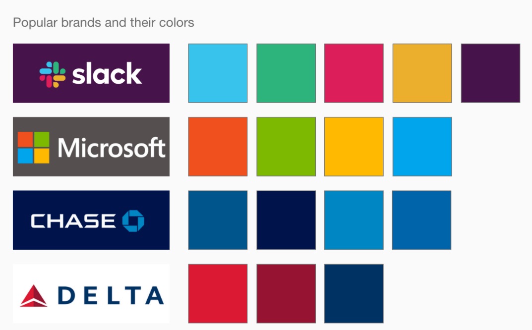
2. Color palette
Colors used in visual branding no doubt carry meanings that have been consciously developed to represent a brand. The right choice of colors in brand identity, such as a brand color palette, can connote specific meanings and evoke different feelings. Some colors even have cultural significance. When choosing a color palette, one should consider what emotions it would trigger, and also the target audience, besides the need for communication across media.
3. Typography and element
Typography is the visual expression of a brand’s voice and tone through text form and style. The right font choice in visual branding will reinforce the brand characteristics, while consistent application of those fonts will offer a binding thread across your brand identity. Besides, graphic elements such as icons, white space, size of image, and element placement for the visual branding must be well considered in order to prioritize information to be given to the audience and to support the message of the brand.
Let’s explore these concepts further by examining the visual branding of a local
brand, shall we
Eatshumay (a local dimsum dining spot in Malang) 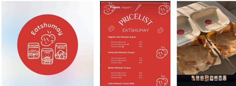
Let’s take a look at Eatshumay, one of the popular local dimsum restaurants in Malang. Eatshumay has done extremely good branding that builds its strong visual identity. Its Unique Selling Point is the variety and innovation it offers in the line of dimsum. Besides the availability of a wide variety of traditional dimsum, Eatshumay also offers exclusive items like dimsum tako. This innovation in their menu makes them stand out, as Eatshumay is considered the first restaurant in Malang to offer such a variety.
Logo Design and Key Elements:
The Eatshumay logo is bright and striking to the memory, with creative elements that leave an impression in one’s mind. Probably in my opinion, the most striking feature of the Eatshumay logo is a woman whose hairline is creatively crafted to resemble a dimsum, which symbolizes the specialty of the restaurant. This incorporation of dimsum into the logo adds a layer of creativity that immediately communicates what the restaurant offers.
Vivid colors, especially red and yellow, draw a lot of attention and give off sensations of warmth and the appetite. These colors happen to be related often with food branding because they trigger hunger and grasp the eye, making sure the logo is noticed on signs and on social media. The colors reinforce the welcoming and energetic atmosphere of the restaurant.
The font used in the logo is bold and rounded, hence giving a friendly and approachable brand image. Inviting typography choice will ensure that restaurants look accessible and casual, perfect for people looking for a no-fuss dining experience. This playful, rounded design also complements the restaurant’s fun and lighthearted approach to dining.
In Malang, where the food scene can be very competitive, Eatshumay’s visual branding is not
only eye-catching but also resonates with its target audience to position itself distinctively in
the local market.
CONCLUSION: a good visual branding
Effective visual branding can shape the identity of a brand and the way it is perceived by the audience. A strong visual identity helps a brand distinguish itself in the competitive market, creating recognition and an emotional connection with its customers. Key elements include logo design, typography, color choices, imagery, and graphic elements that all work together to help create a cohesive and memorable brand presence. This means that, when implemented correctly, visual branding conveys a set of core values and personality for the brand and instills consumer trust and loyalty.
– Developing Effective Visual Branding???
What’s needed most in developing a brand today is to create a solid visual identity. A well-designed visual brand portrays the values of a company, evokes emotions in its consumers, and differentiates it from competitors. Following are some key ways to build an impactful and powerful visual branding strategy:
a. Uniqueness and Difference
While your brand may be in a competitive market, it’s crucial to ensure that it stands out. Even if your product or service is similar to the ones already offered, embedding something unique into your visual branding will keep you ahead. A unique logo, color palette, and design style can draw attention and make your brand more memorable to the audience.
b. Innovation and Adaptation
Innovation, in this regard, makes sure your visual branding stays fresh and relevant. As the tastes of your consumers evolve, and so do market trends, your brand’s visual identity should also be adapting. Gaining insights into new trends in design, technology, and communication is needed to get to know how your brand could adapt to the new trends. This does not necessarily mean that innovating through your visual branding has to be an overhaul of your entire identity, but can be done with only subtle changes reflecting the new consumer expectations.
c. Collaboration and Consumer Insights
The creation of an effective visual identity cannot be done without
collaboration. Today, soliciting suggestions and feedbacks from many stakeholders,
such as employees and designers, and even consumers, can results in a better
outcome. The knowledge of consumer preferences and expectations is bound to guide
the creation of the design.
d. Strategic Brand Management
Effective brand management is essential for maintaining a cohesive and consistent visual identity over time. Managing a brand involves overseeing everything from its visual communication through marketing materials, digital presence, and into the physical spaces where the brand interfaces with customers. Any change or evolution to your brand’s visuals must be methodically calculated and in line with the strategy in general. It will also make sure that the visual branding of your company always stays updated with evolving market trends and company values, hence keeping it relevant.
In conclusion, creating and maintaining a strong visual brand is an ongoing process that requires continuous effort, adaptation, and strategic thinking.
Shelly Graciela