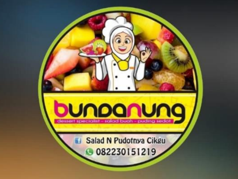
Bundabun Desert Visual Review


For my own criticism and suggestions for the logo and visuals, there is still a lot that needs to be changed, What I can give you suggestions about the logo’s visuals include the following:
- clarity and simplicity
I still can’t remember this logo when I first saw it and in my opinion this logo is still less efficient if it is pasted on several interactives. In my opinion, this logo is still a mess in terms of visuals.
- Relevance
In terms of relevance here, it’s still a little okay because it can show that this brand will sell desserts and other things from fruit, but it’s still not emphasized enough, if the logo concept doesn’t want to show that they sell products, it shouldn’t be highlighted at all or it can highlight the nature of the brand. or you can also just play with typography to make it more efficient
- visual balance
This logo is still not proportional, as I mentioned above, because there are too many irregularities in this logo, so later if it is placed as a mockup or something else, it will still be less effective, the shape is not too bad, but the color is all still messed up, not using color theory and also As for the typography itself, it’s still not very effective when used for this logo because it still can’t be read clearly, like the writing under the logo, in my opinion, it’s really messy and almost unreadable if it’s used later in a small size, it can’t be proportional.
- Attractiveness
As for the attraction itself, here in my opinion it is still not clear what the style will be like. If they really want to use a modern style, they should display a style that can also be made to attract the attention of customers, but here there is still a lot that needs to be changed so that this logo has more character.
In my opinion, all logos are not bad but they are not effective Thank you

