Visual branding Ayam Tulang Lunak


Visual branding Ayam Tulang Lunak
Ayam Tulang Lunak is one of the popular tempting dishes in Indonesia. As the name implies, this dish serves soft chicken meat and with its uniqueness, the bones can be eaten without worrying about the hard bone texture.
In addition to the cheap menu prices, Ayam Tulang Lunak is also known as a pioneer restaurant with the concept of rice, chili sauce, and all-you-can-eat vegetables. Customers are offered to eat at this Ayam Tulang Lunak stall as much as they want and as full as they want. This is one of the uniqueness as a Padang restaurant with its own concept.
Ayam Tulang Lunak Mbok Surip Restaurant / Eateries with legendary taste located in Purwantoro, Blimbing District, Malang City, East Java. Ayam Tulang Lunak Mbok Surip is one of the best-selling places in Malang City. This is because the soft bone chicken market is in great demand as a favorite food for the people of Malang City. With branding using the name soft bone which has been known for a long time, it has become their consistency for years.
In visual branding, Ayam Tulang Lunak forms an image that has its own identity so that it can be better known among culinary lovers. In addition, the personal branding carried out by this restaurant is to attract customers to build an image as a famous restaurant and place to eat.
Visual Approach Logo
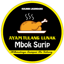
Ayam Tulang Lunak logo has different variations, for example, Ayam Tulang Lunak Mbok Surip. The soft bone chicken logo is identical to the chicken icon as a characteristic of the food offered, namely chicken. making it easier for chicken food lovers to recognize that the culinary they serve is chicken food.
Principles of Visual Design
In building a good image, especially in visual branding, a design principle is needed that will support the commitment of a business. The principle referred to in visual branding includes a visual approach such as creating a logo with advantages that become symbols and identities of the business. In this case, here are the principles of visual branding applied in the visual approach by soft bone chicken.
1. Simplicity
The simplicity in making this logo makes the Ayam Tulang Lunak Mbok Surip restaurant easily recognizable, because of the selection of simple and simple elements. The logo shows a chicken served on a plate which has a meaning as well as a sign of the menu that will be served in the restaurant. The logo can be said to be simple because it takes the logo style from the combination logo. This style is good because it is suitable for the type of trade such as Ayam Tulang Lunak restaurant. Apart from that, the topography used is friendlier to the general public and blends in better with the chicken icon, making it look more attractive.
2. Consistency
Ayam Tulang Lunak Mbok Surip displays consistency in design elements ranging from color tones, typography, logos, to posts on their social media that have consistency in their business. In social media, Ayam Tulang Lunak Mbok Surip provides a visual appearance that looks simple with a color tone based on a yellow and black color palette. These colors also have their own meanings, where black symbolizes professionalism, reliability, foundation, and strength so that it can be trusted as a seriousness towards a business that is run. while the yellow color symbolizes energy and enthusiasm, a color that will bring hope to each visitor to enjoy the food served. In addition, the yellow color is also symbolized as the color of prosperity and the color of beauty as the basis of the food stall. This has a positive impact on the social media of Ayam Tulang Lunak Mbok Surip because it gives the impression of pampering the eyes with the food and color palette provided.
The idea that understands that social media is one of the media to promote their dishes, by creating interesting content that can attract customers with their signature tagline “Not ordinary fried chicken” is their trademark in selling their dishes. In the content listed, their consistency in maintaining their color palette is also the key to the success of the content in attracting many customers. However, consistency in uploading too rarely makes them less convincing, because the content algorithm that can attract more customers is not attempted.
3. Originality
Uniqueness itself is one of the most important aspects in building an image of the restaurant’s identity itself. In this case the logo of Ayam Tulang Lunak Mbok Surip is made as brief and simple as possible. This aims to build an image and identity that is different from the others, where the logo of Ayam Tulang Lunak Mbok Surip is inspired by the food itself which is served on a large plate with rice, fresh vegetables, and chili sauce as much as you like. With a sharp color palette, Ayam Tulang Lunak Mbok Surip has become one of the most popular dining restaurants thanks to their marketing techniques.
4. Versatility
As the previous points, the simplicity of the logo of Ayam Tulang Lunak Mbok Surip is a plus point from most other food stalls because it is easier to remember. In addition, the visuals provided are more interesting because they bring the typical theme of the food that will be provided to customers to enjoy.
5. Timeless
The image built through the logo of Ayam Tulang Lunak Mbok Surip is a type that is easy to remember. Therefore, the logo design that is made is based on the durability of time to time that will still be relevant and can last for a long time. By continuing to use this typeface and logo design, Ayam Tulang Lunak Mbok Surip is believed not to fall in the near future but will survive because it is supported by the legendary slogan from the history of the restaurant.
Conclusion
visual branding Ayam Tulang Lunak Mbok Surip has succeeded in creating its own identity, namely becoming one of the famous culinary in Malang. By applying visual design principles such as simplicity, consistency, originality, flexibility, and durability, they can create a design that they can remember for years to come.
a simple logo with a style that is suitable for culinary marketing, a color palette that is consistently consistent, to the relationship between the logo and the cuisine makes this business able to compete in the culinary market. Although there are some shortcomings regarding marketing trends in the digital era that still need to be improved. The visual branding applied by Ayam Tulang Lunak Mbok Surip is one approach that is able to compete with the national market.
References
- https://kumparan.com/viral-food-travel/4-tahun-cari-resep-pasangan-ini-jual-ayam-tul ang-lunak-untung-rp-750-juta-1tGz2wHSkmN/1
- https://www.zarla.com/id/panduan/jenis-jenis-logo
- https://primakara.ac.id/blog/technopreneurship/visual-branding
- https://digilib.esaunggul.ac.id/public/UEU-Undergraduate-23935-BAB1.Image.Marke pdf
- https://www.facebook.com/ayamtulanglunakmboksurip/

