Improving the Visual Branding of “Kayungyun Porridge”

Visual branding is an essential element in building a brand identity. Through components such as logos, colors, typography, and overall design, a brand can convey messages, create impressions, and establish emotional connections with its audience. Visual branding is not just a symbol representing the brand’s name, but it also plays a crucial role in strengthening the brand’s identity. In an increasingly competitive business world, strong visual branding not only helps the brand become more recognizable but also enhances customer trust and loyalty. Additionally, effective visual branding makes it easier for the audience to remember the brand.
However, not all brands manage to maximize the potential of their visual branding. One example is Kayungyun, a culinary brand offering a variety of porridges in the Malang area. Their flagship menu includes chicken porridge, green bean porridge, and black sticky rice porridge. The name Kayungyun is derived from Sundanese, meaning “cute and appealing,” reflecting the friendly image the brand wants to project. With a target market ranging from young people to adults, Kayungyun is often a popular breakfast choice, especially among students, thanks to its numerous branches near university areas and its successful online sales. The brand’s visual signature lies in the unique and easily recognizable font of its logo. However, overall, Kayungyun’s visual identity is still not strong enough to consistently represent the brand’s values and character, presenting a significant opportunity for further development in creating more engaging and effective visual branding.
Logo Analysys
To further explore the strength of Kayungyun’s visual branding, let’s take a closer look at their logo.
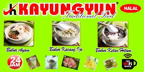
The Kayungyun logo consists of the letter “K” combined with a checkmark symbol, but the placement of the text “Kayungyun” next to it creates a discordant and less harmonious effect with the logo elements. This disrupts the message and identity that the brand aims to convey. Additionally, the inclusion of the phrase “Traditional Food” in a font that is hard to read only adds to the confusion in the overall design. While the font used for the name “Kayungyun” has a unique and recognizable character, other design elements need to be more consistent to create a stronger and more easily identifiable visual identity. The use of neon green, red, yellow, and black colors certainly attracts attention, but this overly bright combination feels excessive. In design, colors should support a fresh and appetizing impression, which is crucial for a food brand. Therefore, adjustments are needed to ensure that the colors and logo do not distract from the core message of the brand.
Kayungyun’s promotional design, both offline and online, is still lacking in appeal. The current design makes it less enticing for consumers to try their products. The information presented is also hard to understand due to the font being difficult to read, especially when describing the menu. Additionally, the placement of the menu images feels disjointed and doesn’t align with the concept the brand aims to showcase. This detracts from the visual appeal and affects the consumer experience. However, the packaging of Kayungyun’s porridge is fairly good and attractive, giving a positive impression and making it easier for customers to recognize the product.
Therefore, improvements Kayungyun can make to create effective visual branding include:
1. Logo Redesign
Kayungyun can enhance the logo design by creating a logogram that better aligns with the logotype used. A more harmonious combination of visual elements will create a stronger and more consistent impression.
2. Font Selection
Maintaining consistency in font choice is crucial for ensuring that the information is easy to understand. Choosing a font that is simple yet reflective of the brand’s character will
improve readability and reinforce the brand’s image.
3. Color Selection
The use of overly bright colors can be adjusted by selecting a more balanced color palette with fewer variations. Kayungyun might consider softer yet still fresh colors, which would be more appetizing and better suited to a food brand’s character.
4. Improvement of Promotional Design
Kayungyun needs to improve the design of promotional materials, such as banners, menus, and other materials, to make them more visually appealing and effective in conveying clear information to consumers.
5. Use of Visual Elements that Represent the Product
In addition to the signature neon green color, Kayungyun could incorporate more visual elements or iconography that reflect their main product, such as illustrations of porridge or fresh ingredients. This would help the audience quickly recognize the product, strengthen the brand’s impression, and make it easier to remember.
Conclusion
While Kayungyun has significant potential in visual branding, there are still several areas that require improvement. The current logo lacks balance with the other design elements, reducing brand consistency. The hard-to-read font and overly bright colors also diminish the visual appeal. Promotional designs, both offline and online, need enhancement to convey information more clearly and attractively. Although the product packaging is already fairly good, improving other design elements will further strengthen Kayungyun’s brand image and enhance the customer experience. By consistently improving these elements, Kayungyun can solidify its visual identity, attract more attention, and build a closer relationship with its audience.

