Liquid Theme Experimental Typography
Experimental typography is one of the most contributing art movements for development of modern graphic design and important developments had been seen in it. Free typographic studies within this movement have affected modern designs too. One of the earliest examples of experimental typographic book covers is the cover of the book “The Mayor’s Tongue” designed by Jonathan Grey in which letters were formed as words coming out of a mouth. Names of the book and author were in an open and dynamic composition, which was created by using different sizes and colors.
In daily life, especially in the field of entrepreneurship also requires the function and form of the Experimental Typography itself. Because some agencies that have a specific purpose sometimes also do not find a font that matches the theme that they raised, so they are required to make their own fonts called Experimental Typography.
In daily life, especially in the field of entrepreneurship also requires the function and form of the Experimental Typography itself. Because some agencies that have a specific purpose sometimes also do not find a font that matches the theme that they raised, so they are required to make their own fonts called Experimental Typography.
The example that we most meet is stated in the poster design, because almost all announcements and media reading events to convey information use posters as a means to deliver it.
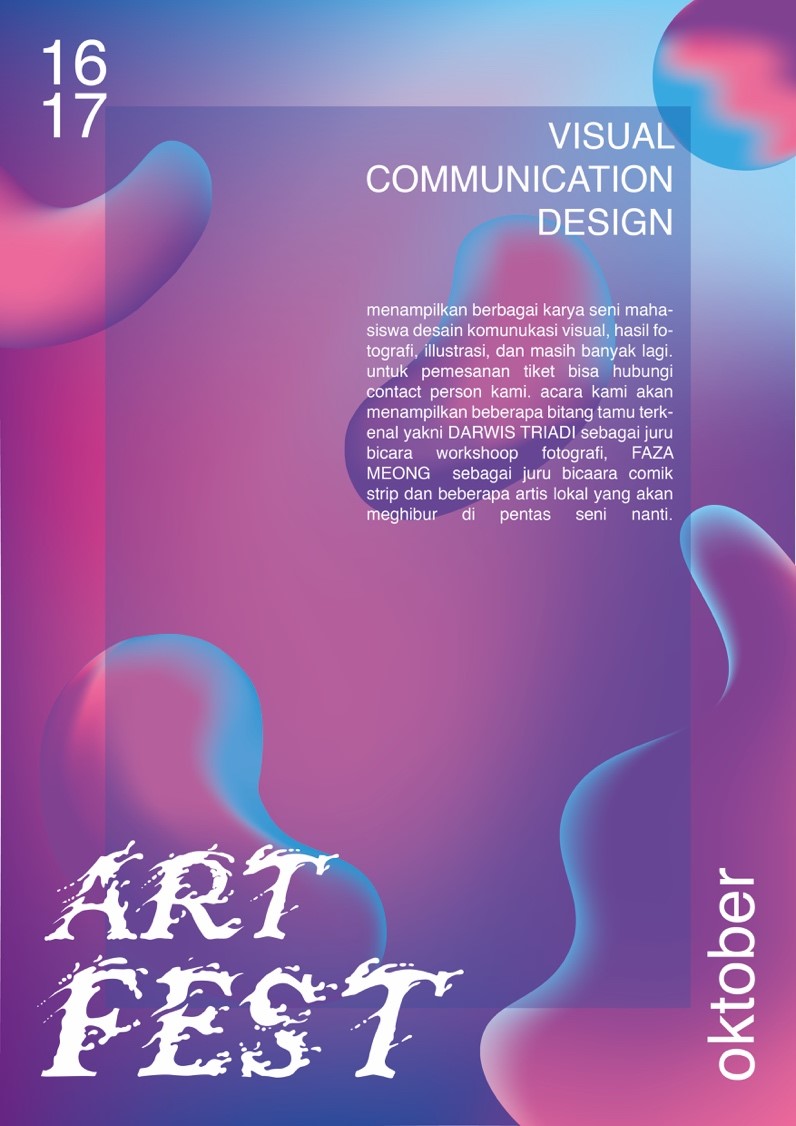
Like the poster design that I designed, I took the liquid theme and I applied it in the Baskerville font, one of the serif typeface design fonts. I applied liquid around the font that I used and it seemed to have a splash effect on the water.
the reason I chose the liquid theme is that I want to combine certain fonts with other elements outside of typography, like the Baskerville font I have chosen. Besides that, I have my own compatibility with some colors like purple, blue, and pink. However, the colors will look monotonous if they are not suitable for use, that is the reason I use these colors on my poster. To unify the colors of the colors I use a gradation effect on all colors so that they become one.
Then why do I use white in all the fonts that I use? I want to give emphasis to the information conveyed, some colors I use and the most appropriate is white.
For my own fonts, not only can I use them in event posters like the example I listed, but they can also be used on banner, brochures, magazines, and so on. I use the event poster as an example because the event poster is the most fitting for the use of the font that I made. The font that I created also has a few flaws, the disadvantage of my font is that there is no unity in each hurf with the others, so that what is my job again is to think about how to make each set of words conveyed can have a connectedness with each other.
Co Author:
Muhammad Adib Minanurrohman – 2201811199
Comments :