Hieroglyph Experimental Font Concept
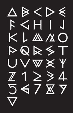
Experimental fonts have different rules than other fonts. Usually the most basic font rules are that they must be clearly readable, but these rules do not apply to experimental fonts. So my concept is I was thinking about how to make my experimental font need a more understanding to be read yet very simple. So I’m thinking for my experimental font concept comes from ancient symbols. Initially I was inspired by Hieroglyph but Hieroglyph is still very complex for my font and I wanted a design that was more simple and minimalist so I decided to use the alien version of the Hieroglyph. In case you’re wondering this is the Alien Hieroglyph that I used for creating my experimental font.
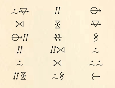
In addition, I am also inspired by the cave symbols from stone age that is usually found in caves. This is the cave symbols reference that I used in creating my experimental font.
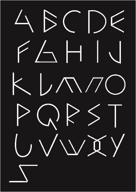
Both the Hieroglyph alien version and the cave symbols from the stone age has a very simple and minimalist design and the design fits to be made into a typeface so this design is in accordance with my concept. So I combined the design of cave symbols from the stone age and the alien hieroglyph to make my experimental font and I made it even simpler to make it seem luxurious, but it still needed a little thought to read. I used the design mostly from the alien hieroglyph, but still used some of the part from the cave symbols. I used some of the letter’s bowls from the alien hieroglyph such as the letter B and some of them are from the cave symbols such as the letter D, O, Q, letter strokes from the alien hieroglyph, A and Z letter stem from cave symbols, letter bars from the alien Hieroglyph as well. After several attempts of merging, testing, finally I have achieved the results that I wanted in my experimental font. This is the results of my font experiment and I made it into an alphabet.
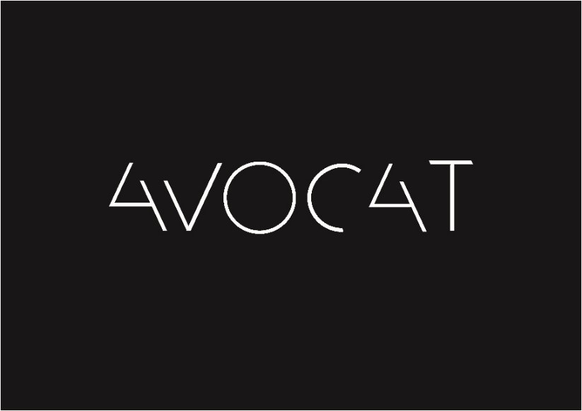
So you can see that my experimental font is very simple, minimalist, and luxurious. Although this design is derived from Hieroglyph and ancient symbols, this design looks / feels like luxury, technology, elegant and futuristic but is still takes some time to read and understandable I use this design for themes such as music entertainment. And as for the output of the experimental font I’m going to make an entertainment poster. Just like my experimental font, I used simple, minimalist, luxurious concept design to fit with my experimental font. So this is my prototype entertainment poster.
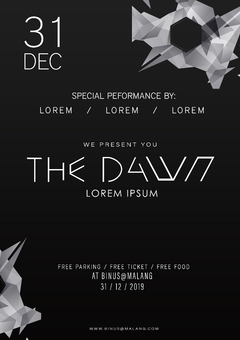
I used 2 fonts for my poster. I’ve added some visual elements in the bottom left and top right in the form of a white abstract object. The reason I added the white abstract object is because my concept is a Techno music, luxurious and a little bit of futuristic design.

Comments :