Fun School Experimental Fonts
Co Author : Yosua Felix S (2201787234) – DKV 2022

Typography 2 task this time is about experimental fonts, experimental fonts are font types that are different from fonts in general, if the fonts in general must have a clear legibility if the experimental fonts do not place importance on the concept of readability, experimental fonts do not have any limitations because they do not exist separate rules that bind so the more diverse the more attractive the font looks, the experimental font has a core focus on its strange and different shapes, for the experimental font this time I chose to use the “School” font. For the concept of the font I use the theme “fun school”. I use elements of school equipment such as erasers, tape, rulers and staples. Which is then combined with the sans serif font, I made it look like this for the beginning

First Concept
 However, because it did not look like an experimental font, I finally took the concept of various geometric themes, which finally made the font look more pleasant than at first, but still lacked the joy, and still looked flat. After that I use the reference of a geometrical font and mimic the use of various colors and give many pieces in the font, the colors that are chosen are bright colors to express their joy with a combination of many colors, and in some shapes colors are given gradations that provide variations. In addition to providing the effect of the cheerfulness of the use of a variety of colors to address the atmosphere in various schools, warm colors are used to describe the cheerfulness, excitement, and togetherness in a school environment, while cold colors are used to describe a serious school atmosphere, intelligence, peace and balance. For comparison, the colors are more directed towards warm colors because I want to emphasize on the theme of “school cheer” earlier.
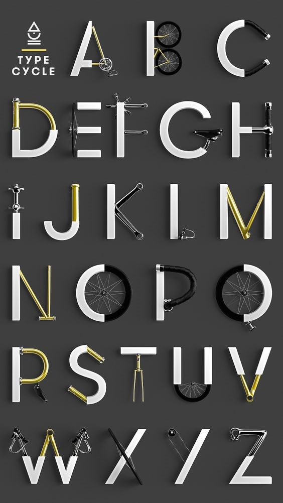
(Reference)
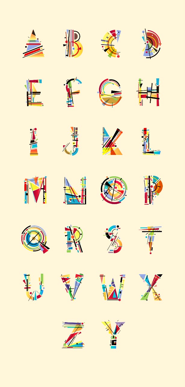 For forms that are separated and unstable but geometric to give the impression of being different from each other, this is more aimed at human nature. Human nature is very diverse and uncertain, in schools there are cheerful children who are shown in yellow, there are angry children who are shown in red, there are children who are calm shown in blue, there are neutral children shown in green, there are children which has a variety of properties shown by gradations of color, and the diversity that I want to highlight by using unstable and different geometric shapes. Why do I use geometric shapes, because geometric shapes are something that must be taught in school and are the basis of everything, geometric shapes have no limits they can develop according to our own creativity both from the shapes of squares, circles, lines, triangles, trapezoid, and others, and also geometric shapes cannot be separated far from school because we certainly get them from the beginning of kindergarten to college, we cannot get far from geometric shapes, so I feel that the geometric shapes are in accordance with the school. The shapes that describe the elements of the school are still shown with the school items, I use the equipment is not aimed at the side of the school, but because the equipment is still included in school supplies in general, so I use it.
Final Result
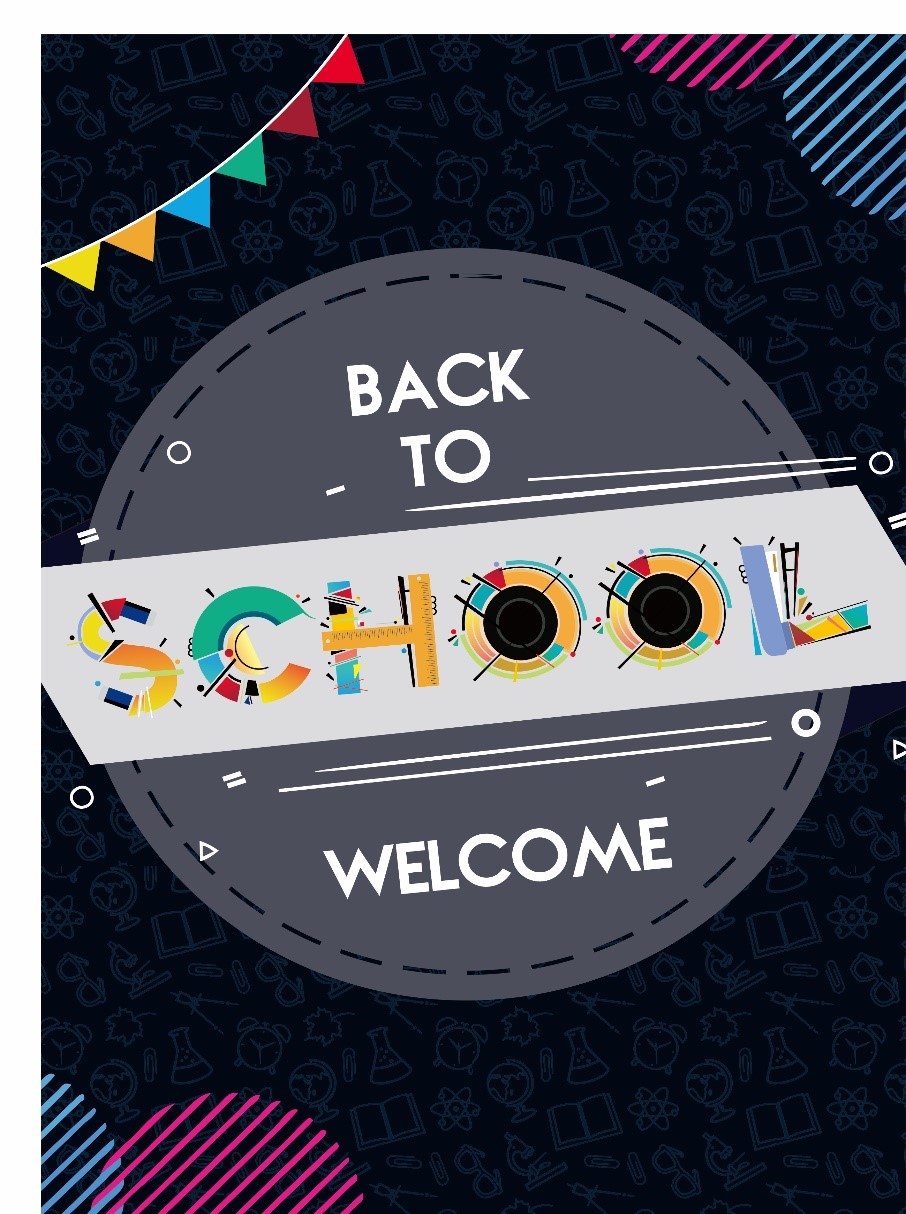
Poster
Comments :