Artistic Experimental Typography
Co Author : Michelle Venia (2201779762) – DKV 2022
Experimental typography is one of the most contributing art movements for development of modern graphic design. As time goes by more and more types or models of experimental fonts, ranging from simple to complex, from easy to read to those that have to digest each part. Experimental font posters can be found and many are found on inspirational posters, or event posters. But most of the experimental fonts used are very simple but have a value of creativity.
For me, I prefer something simple that is not complicated but has beauty and creativity in every part of it or arguably aesthetics. To make an experimental font typography rules are not needed. But still put attention to the comfort when reading and the value of creativity. Because the comfort of reading is very important in conveying information or works to the reader.
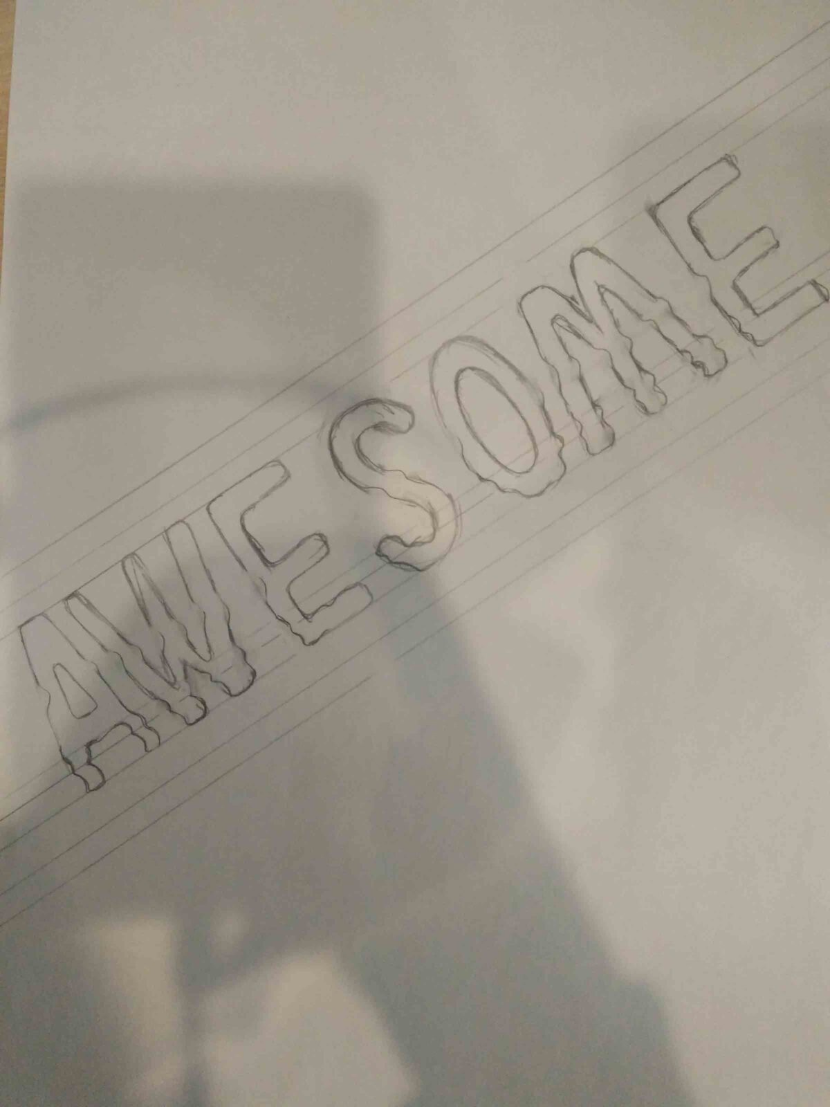
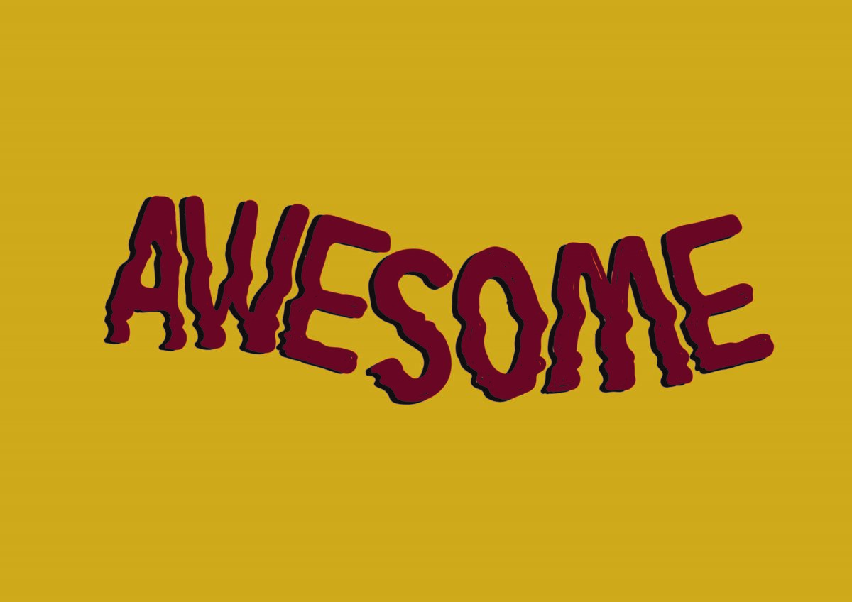
The purpose of making experimental fonts is first about the development of the era and modern advances where graphic design art is growing rapidly. Second is about the value of art that is getting more advanced in this era and an increasing level of creativity as well. Third , the high sale value in a work created with supporting components in it. In this task related to experimental fonts, I tried to make an experimental font. I experimented with fonts and made fonts look sensitive. Like there is a push on one side of the letter that makes one side of the letter more prominent. Can be said as nirmana or as a flow or wave. The font character itself is not too firm but has a thick volume to show confidence. To be able to make this font at first I took the idea of someone’s index finger that touched someone else. Then from there I remembered the material nirmana. So I combined the two things that I found so that I can make this font. The first process is by scribbling on paper to find which points are curved, giving outlines and determining the font size. Then after the results obtained the next step is to digitize the font. Actually this font if it has been assembled into a word is not difficult to read, because the characters themselves are simple and the experiment of this font can still be read. This font can show about interesting things, such as circus, dark but mysterious, creative, and other things. The color used is a dark color, due to the font character. Maybe what can be improved from this font is the sharpness of each basin that has not been balanced between the fonts made. But to look like “ nirmana “ is already seen enough.
No matter how simple the font, basically every work has artistic value and creativity in it. Assisted with other supporting components will make a work look more interesting and have more value. Depends on which side we see the work and what we value.
Comments :