A Concept of “Aksara”
Co Author : Trixie Evangelina Reditta Utomo (2201767125) – DKV 2022
“Aksara” is a type of letter that takes inspiration from ancient scripts originating from India but has a big role in the history of Indonesia. The Pallawa script is the first written form that appeared in Indonesia so that it can be published if this type of letter is the forerunner of the Indonesian characters which appeared after the Pallawa era.
In the archipelago, click here to find out whether Pallawa is a compilation of the discovery of the Mulawarman Inscription in Kutai, East Kalimantan, which was obtained from the 5th century AD. The earliest written evidence available in West Java and at the same time as the island of Java, the Tarumanagara Inscription dating from the 5th century, was also written using the Pallawa script. The name of this script comes from the Pallava Dynasty which was in power in southern India between the 4th century to the 9th century AD. The Pallava Dynasty is a dynasty that embraced Jainism.
Can be given if the Pallawa script is the ancestor of the scripts that emerged in Indonesia afterwards, such as the Javanese script, the Balinese script, the Kawi script, the Sasak script, and the Lontara script. The characters have different forms, but still remain a derivative of the Pallawa Script.
With the historical background of the Pallawa Script I became interested and made the Pallawa Script become my reference in this experimental font project. However, aside from historical reasons, I myself feel interested in the forms of these types of types that appear to have certain characteristics.
Despite its uniqueness, the Pallawa Script itself is less well known and many people even think that the Pallawa Script is a “Javanese Script” which is clearly a different typeface. And also the typeface that makes the Javanese script as a reference of the new typeface has been widely used. So I decided to use the Pallawa Script as a reference for this project.
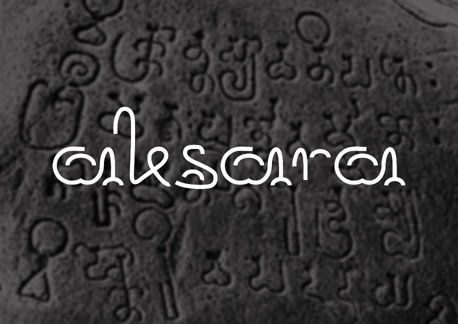
In this project I took some elements that are typical of these type faces. The elements I took included curved lines, semicircular lines, and shapes that resembled half a heart. Even though this project is an experimental font project that should create a font that breaks through the boundaries or rules of the font itself, I still want to show if the typeface that I design remains unique, has character, but still has an easy level of readability. And also in this typeface I want to show or not eliminate the characteristics of the original typeface namely Aksara Pallawa by staying focused on the typeface that looks “fat” or “full” and dominant with curved lines and half-hearted shape and half ellipse shape as a cover of the group upright letters.
The following are the inspiration elements that I took:
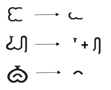 By taking some of the elements from the Pallawa Script typeface, I developed it into the letters that I had made. Next I will explain one by one which I have divided into several groups.
• The group of letters that have a “bowl”: a, b, d, p, and q
In this group of letters I made it a little similar or similar to the beginning of the discovery of the letter a, then I applied it to other letters that had a bowl.
The characteristic that I did not remove was the half-hearted curve.
For letters a, p, q with the same bowl shape and then given a half ellipse shape inside it is still the same size, then for the vertical lines are given a connecting line with a curved line and at the end of the vertical line ends with half ellipse lines that have different sizes.
• Groups of letters that have “curves”: c, e, o, s
By using the basic form of the bowl letter “a” then developed into these letters. In other words take the bowl from the letters p and q but in its solution removes the vertical lines so that only the shape of the half-day rounded by giving some accents namely for the letter “e” added the shape round, then the letter “c” is given a half circle line, for the letter “o” using the original pallawa script and the letter “s” also modifies a bit of the original character.
• The “Upright” group of letters: h, b, k
The presence of upright elements in these letters makes me add a half ellipse shape as a cover at the end of the vertical line (as if serif) so that the shapes of the letters seem to merge with other letters, and also still refer to my concept that accentuates curved shape so that the upright forms that exist do not seem stiff.
• Group of letters beyond the three points above: f, t, r, x, z
Outside the letters that I have mentioned there are five letters whose form cannot be equated with the others because the shape of the letter does not have the characteristics possessed in most letters so in these five letters I only add accents that are in other letters and as much as possible to make the shape is not firm and still refers to the arch form.
With the explanation of the concept that I have explained above, the thing I want to emphasize is in the work of this experimental font project I used the Pallawa script as the basis of its development by taking some elements that exist in the original typeface then I developed it again into new letters so seem more modern and attractive. And it is also not without reason if I take the Pallawa script as a reference or basis of work, I have a strong reason that is a historical reason that says if the script is a witness of the glory of the archipelago so indirectly I want to give appreciation to the script which, although not originating from Indonesia but from this script new characters were born which have now been made into Indonesian cultural heritage which makes Indonesia a diverse culture both in our eyes and in the eyes of the world.
Comments :