GAME FONT CONCEPT
Experimental letters are a typeface that is different from other font types. If other types of fonts have rules that are easy to read and easy to understand, but experimental fonts don’t have all of them, experimental fonts have broad shapes and are free to make. But the experimental letters themselves have their own aesthetic differences and values compared to other types of letters.
In this typographic experimental letter assignment, I chose the theme “GAME” as my base in making experimental fonts. I was inspired by retro game fonts that were more towards pixel fonts, making them characteristic in their time. Then for the game that I chose is MARIO BROS, why MARIO BROS? Because MARIO BROS has a high popularity and has a high demand for games in the world. Actually not only Mario games. However, I think the Mario game is really suitable to be a representative of the retro games of old. At first many thought that this experimental letter design was a mincraft game, said to be like that because of its identical shape, but the difference only exists in the form of 2D fonts instead of 3D like the original Minecraft.
- First Experimental Font
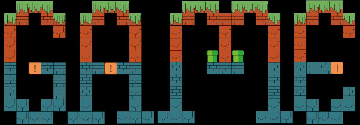
Above is an example of a font that I made, by combining retro fonts and shapes from level 1 and level 2 of the mario bros game such as blocks, rocks, grass and added with typical ornaments of the game. Of course this type of font can be used in retro games other than mario bros. Can also be used in other games, for example Minecraft.
- Final Experimental Font
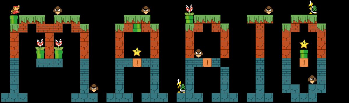
And for the Mario Font above, only minor minor details are added such as Mario, Mario enemies, pipe monsters and Mario special stars to make it look more “MARIO” and really look like in the original game. It can be seen that although additional ornaments are added, the font can still be read. The MARIO font above can also be used for event posters, game covers, or motivational posters.
- Concept Poster
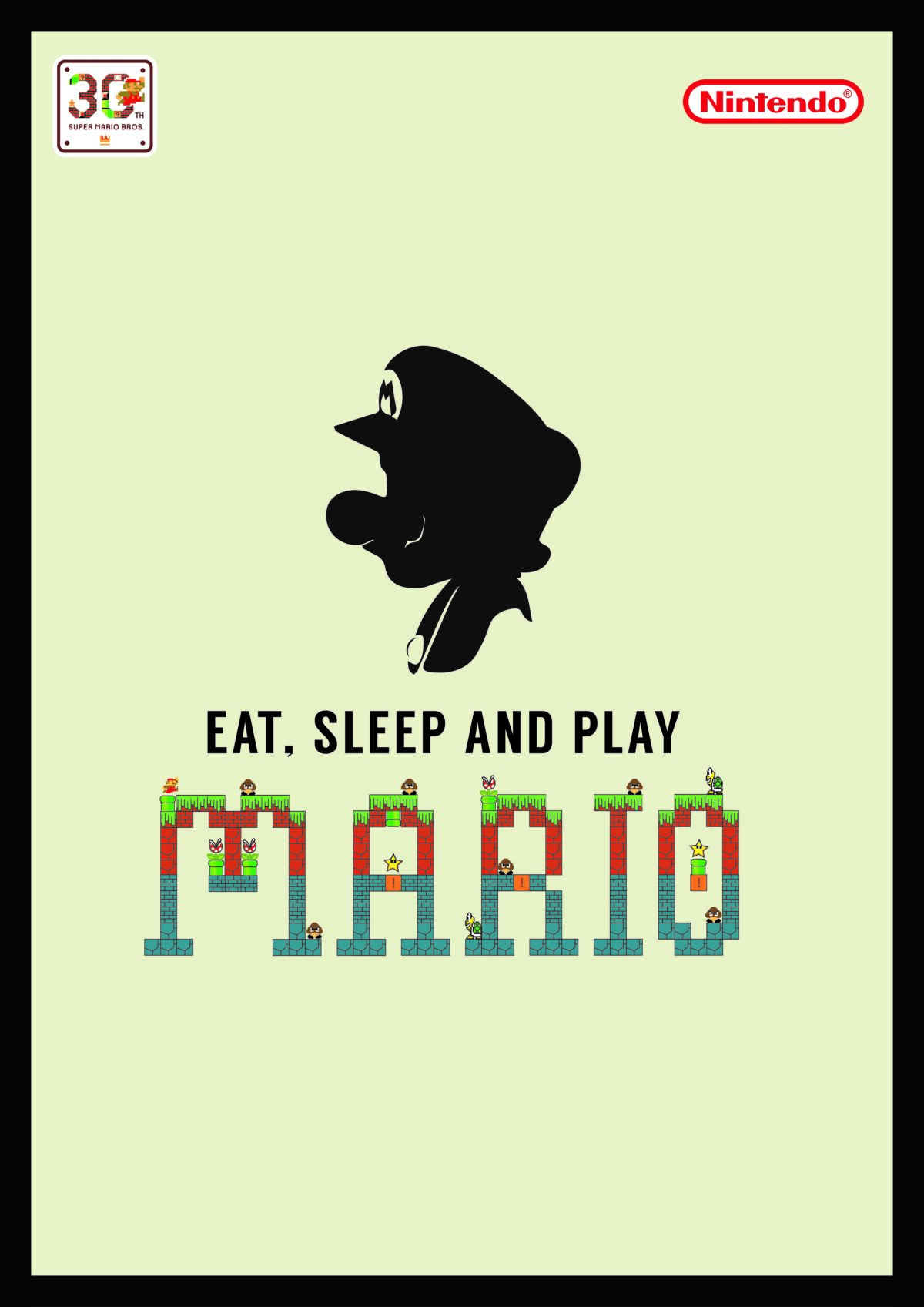
In the poster that I made, I want to emphasize the legendary Mario Bros game that has entered the 30th anniversary of the game of Mario Bros. In the initial poster, I want to put forward the mix of the Mario Bros game prefix display with its new look, to make it look that the development of Mario Bros for 30 years is really significant and the phrase “EAT, SLEEP AND PLAY MARIO” represents the life of a gamer especially the professional players of Mario Bros . The Nintendo logo is the logo of the Mario Bros game manufacturer itself and the “30th Anniversary” logo is the logo of the 30th anniversary of the Mario Bros game this year. On this poster there are also Mario enemies such as the mushroom like Goomba and the Piranha Plant which is shaped like an insect-eating plant.
Whereas the second poster displays the silhouette of the Mario which symbolizes the Mario itself and the phrase “EAT, SLEEP AND PLAY MARIO” has the same meaning as the first poster and a simpler appearance. The Nintendo logo and the “30th Anniversary” logo have the same meaning as the first poster.
The color used in the first poster is the background of the game of Mario Bros itself and in the second poster puts forward the impression of being simple and relaxed because Mario Bros itself is an exciting game when played while relaxing.

Comments :