“BUILD” FONT CONCEPT

For this experimental typography assignment, I made the “Build” font. “Build” font was created from the isometric blocks of lines and three dimensional shapes such as cubes, blocks, etc, combines with few curves like half spheres, spheres, oval, etc. The name comes from the main shape of this font, they are similar to building, particularly modern geometrical architecture. For my personality, I really like the pastel colors because it gives soft mood, tranquil and inviting. And recently I just finished a game called Hyper Light Drifter, and the graphics from the game mainly take form as wonderful isometric illustrations which gives me the idea of upgrading this font from 2D to 3D. Because of the characteristic of an experimental font which is to express the artist’s sentiment, I picked the pastel color pallet combined with isometric shapes to communicate my recent interest (which is the game that I just mentioned and the overall color).
In most cases, the characters of architectures or building shapes are sturdy, rigid, dull or black and white. This font’s goal is to break down those stereotype of the tough and strong construction into the vibrant and cheerful, it convey gentle feelings, calmness, and a bit of feeling of being in a dream, yet the geometrical form make it still have the still sturdy and firm building feature. Not only that, I also enhance the building look by giving it some details from exterior appendages such as windows, glass, stairs, doors, potted plants, trees, street and garden lamps, green bushes, concrete sidewalks, balconies, tables, chairs, glass railings, awnings, and plenty more. The 3D Isometrically style which makes it stands out pretty well from the standard 2D font gave the font an additional depth, adding to the perfection of the art. The font is applicable for any type of graphic design – print, web, motion graphics, poster, greeting cards, etc.
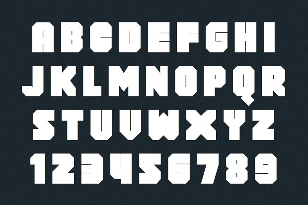
The process of making this font is rather difficult. For the base font, I use Block Typeface Font. This is an incredibly big, bold and “bad-ass” typeface to work with. If you are looking to create a really big logo and work around it with interesting piece of graphics, this would be the most common typeface to choose. This is excellent for both posters and prints. In many a cases, such fonts have also been used to display movie titles. With the squared edge and less of circular shapes, I use this font for displaying the rigidness of the architecture. And by using this as the base font it doesn’t mean Im 100% tracing the shapes. I only use it for references and altering few of the original form. For example:

See some familiarities and major difference right? The sharp crook at the middle right side of “B” Building font resembles with Block Typeface Font. The flat surface of the top and bottom of “B” also identical. The thing that differentiate the design of these two font aside the colour are the size of counter form of the B and the lack of the 45 degree slope on the top right and bottom right of the bowl. Referencing doesn’t mean you can copy the whole design. Use IAO instead (Improvise, Adapt, Overcome)
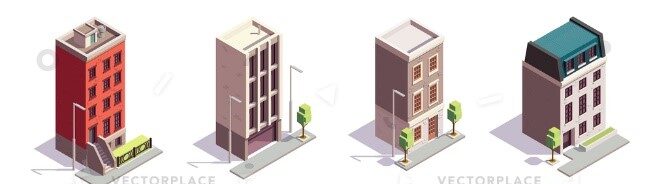
Meanwhile the building details comes from this reference picture. The square-ish modern architecture filled with many windows panel and flattened roof. Also if you look closely there is similarity from the brick motifs details. The trees and small garden lamp are traced from this reference too. Albeit the font design isn’t nowhere nearby this intricate, it still have some of it influences.

Comments :